Read this article in 日本語.
We’re excited to share that Vivaldi Social has been updated to Mastodon’s latest version of 4.2.4. Additionally, we have also turned on Mastodon’s translation feature to help you translate posts to your chosen Vivaldi Social interface language, and we have given you the option to add fresh new themes to your Mastodon interface.
If you’re new, our Mastodon instance – Vivaldi Social – is a decentralized social network, providing an alternative to networks controlled by Big Tech. Vivaldi Social was created as part of our continued effort to provide better alternatives for people to communicate in an algorithm-free environment devoid of surveillance, tracking, or data profiling.
So, let’s take a deeper dive into the new updates of Vivaldi Social on Mastodon’s latest 4.2.4 version.
Updates to Vivaldi Social on Mastodon’s latest version
Translation
Vivaldi Social brings together speakers of many languages. While it’s fascinating to know what people are up to in various parts of the world, it can be challenging if you don’t speak their language.
To help you cross language barriers, Vivaldi Social now uses the freshly updated translation service powered by Lingvanex, a service familiar to those who use the Vivaldi browser.
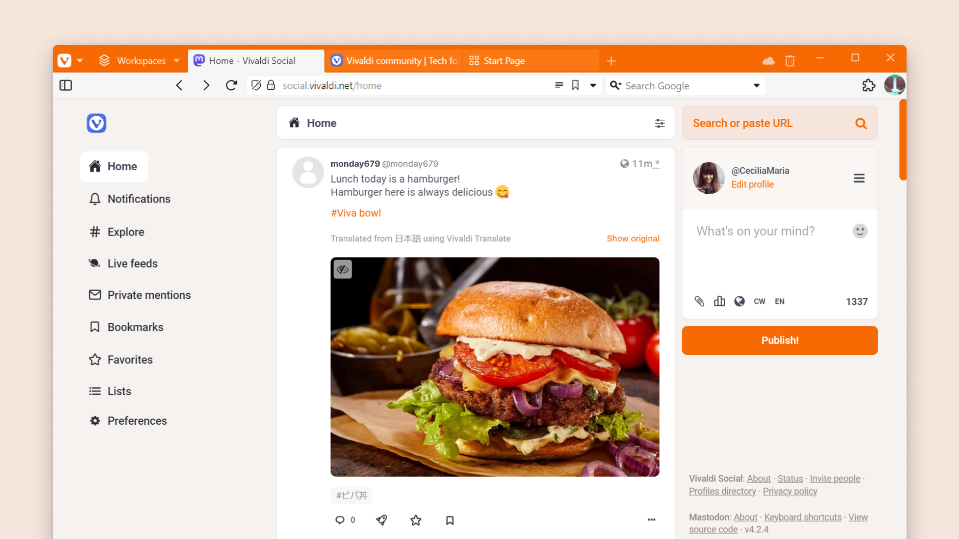
Suppose the author of a post has set their post’s language differently from your Vivaldi Social user interface language. In that case, you can simply select “Translate” below the post to view the translated version.
For instance, our thriving Japanese and German communities on Vivaldi Social have a lot to share! With the press of one button, you’ll be able to have conversations with individuals from other walks of life across the world.
A general side note is that the translations will not always be accurate if the text’s language and the language assigned to the post do not match. So content creators especially need to be aware of these minute but impactful details. You can review your user interface language settings in Preference > Appearance, and your posts’ default language settings in Preferences > Other > Posting defaults.
Themes
Adapting the user interface according to your preferences, not the other way around, has been one of our core values with the browser, and we apply it to our web services as well.
Personalization has more benefits than we think. Tailoring any interface to your liking is like personalizing your workstation at home or in the office. It fosters a sense of ownership and boosts efficiency and productivity by creating a familiar and enjoyable experience.
This is why we’re happy to have added new theme options to Vivaldi Social in this update. You can now choose from the following 10 themes.
There are the well-known defaults:
- Mastodon (Light)
- Mastodon (Dark)
- Mastodon (High contrast)
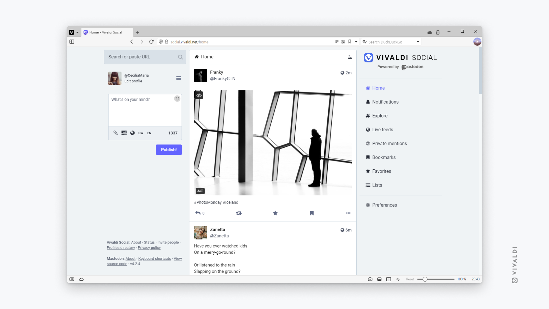
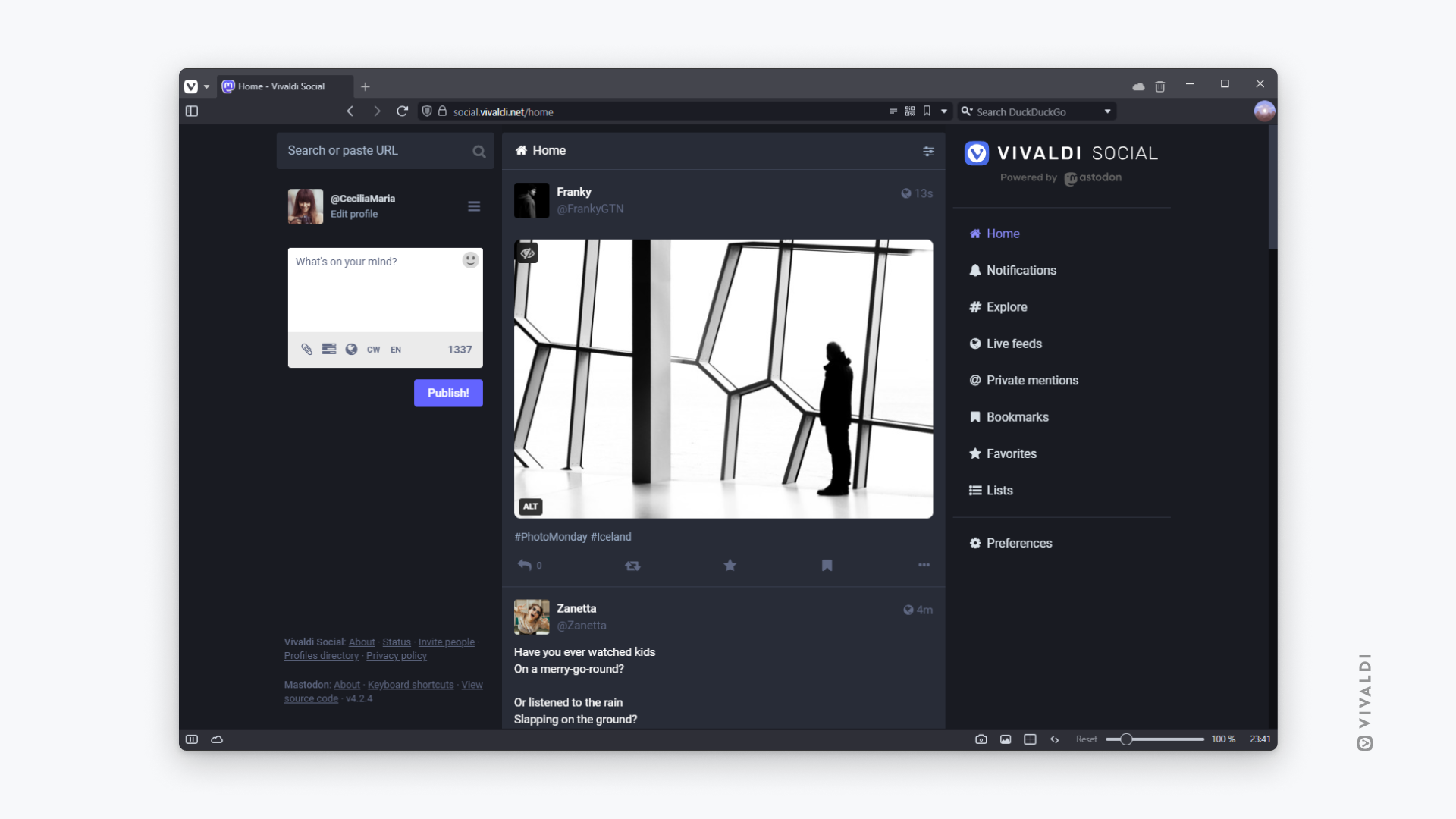
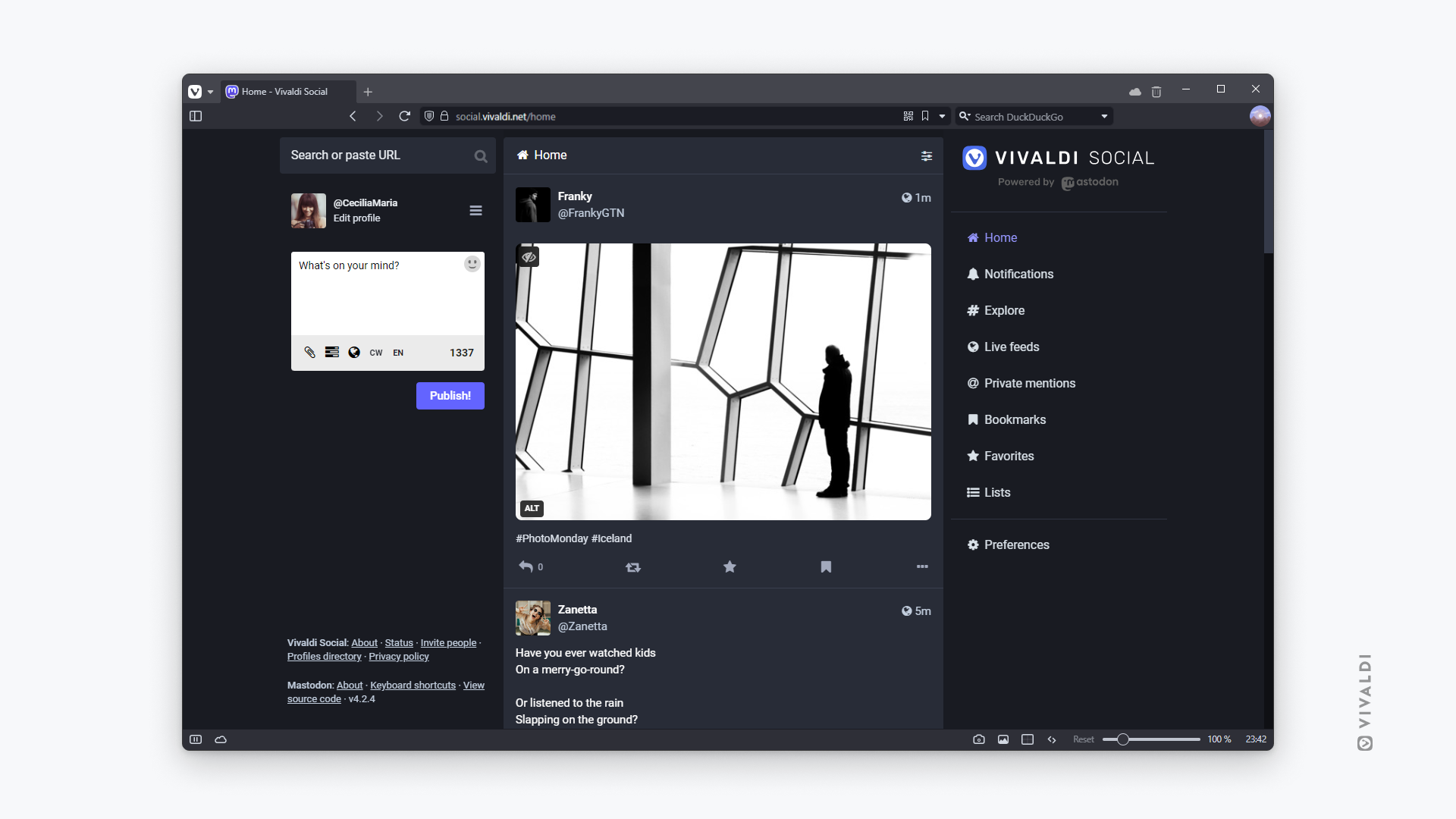
We’ve added two new sets of custom themes — Tangerine UI and Mastodon Bird UI. Both themes flip the interface to display the menu on the left side of the feed, keeping the posting and searching options on the right side.
Both the Tangerine UI themes detect your system settings to display either the light or dark version of the theme.
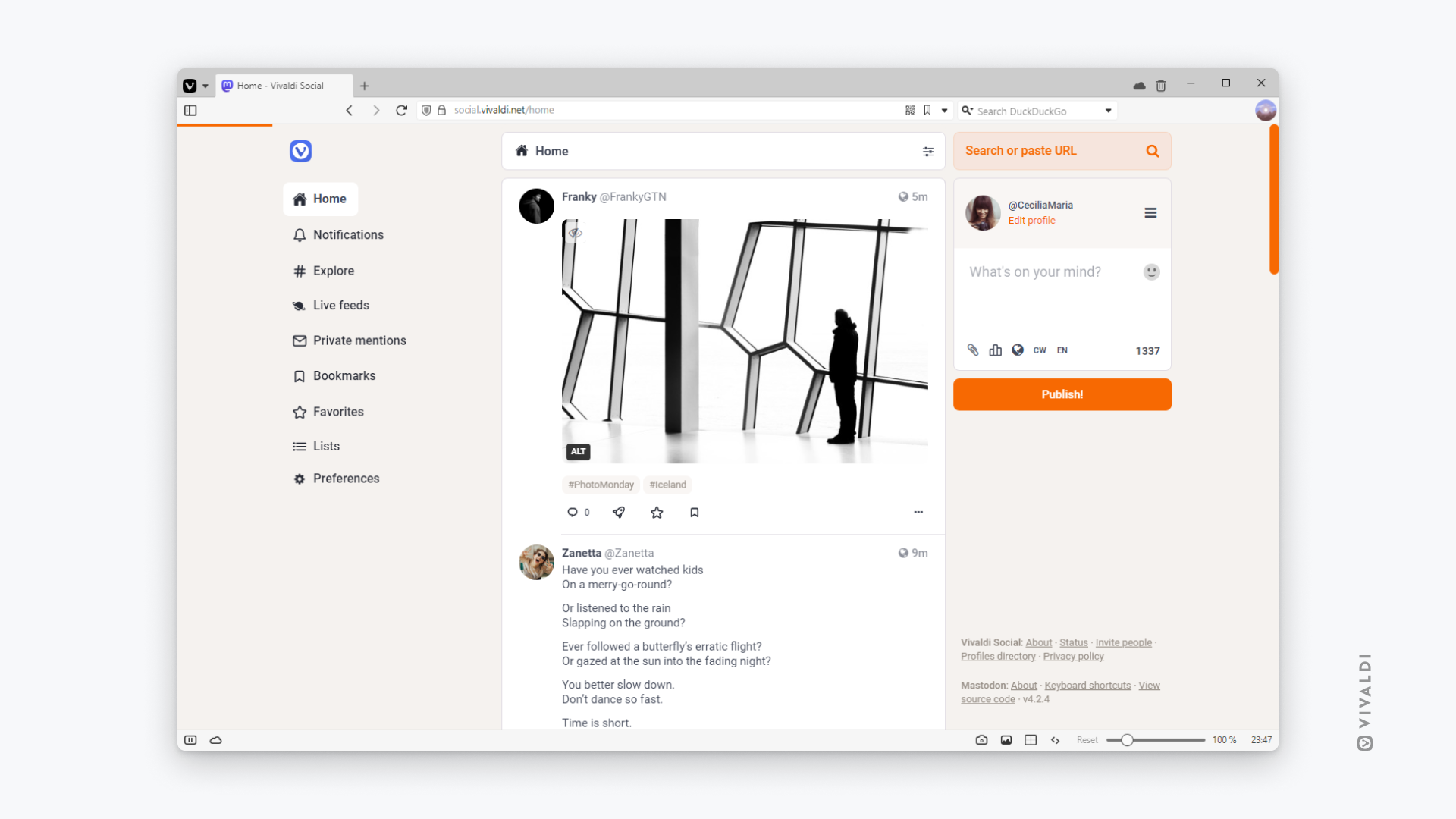
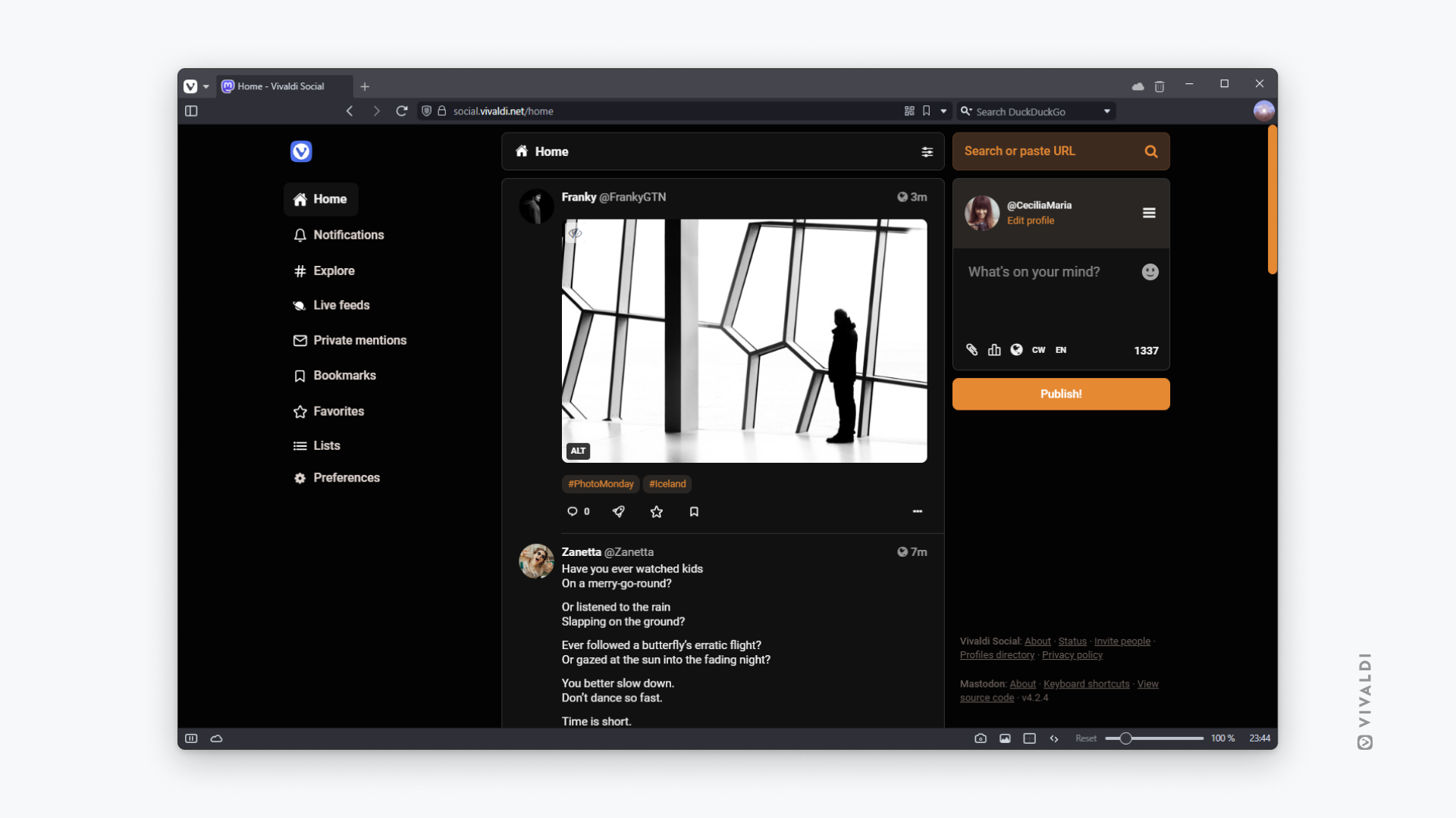
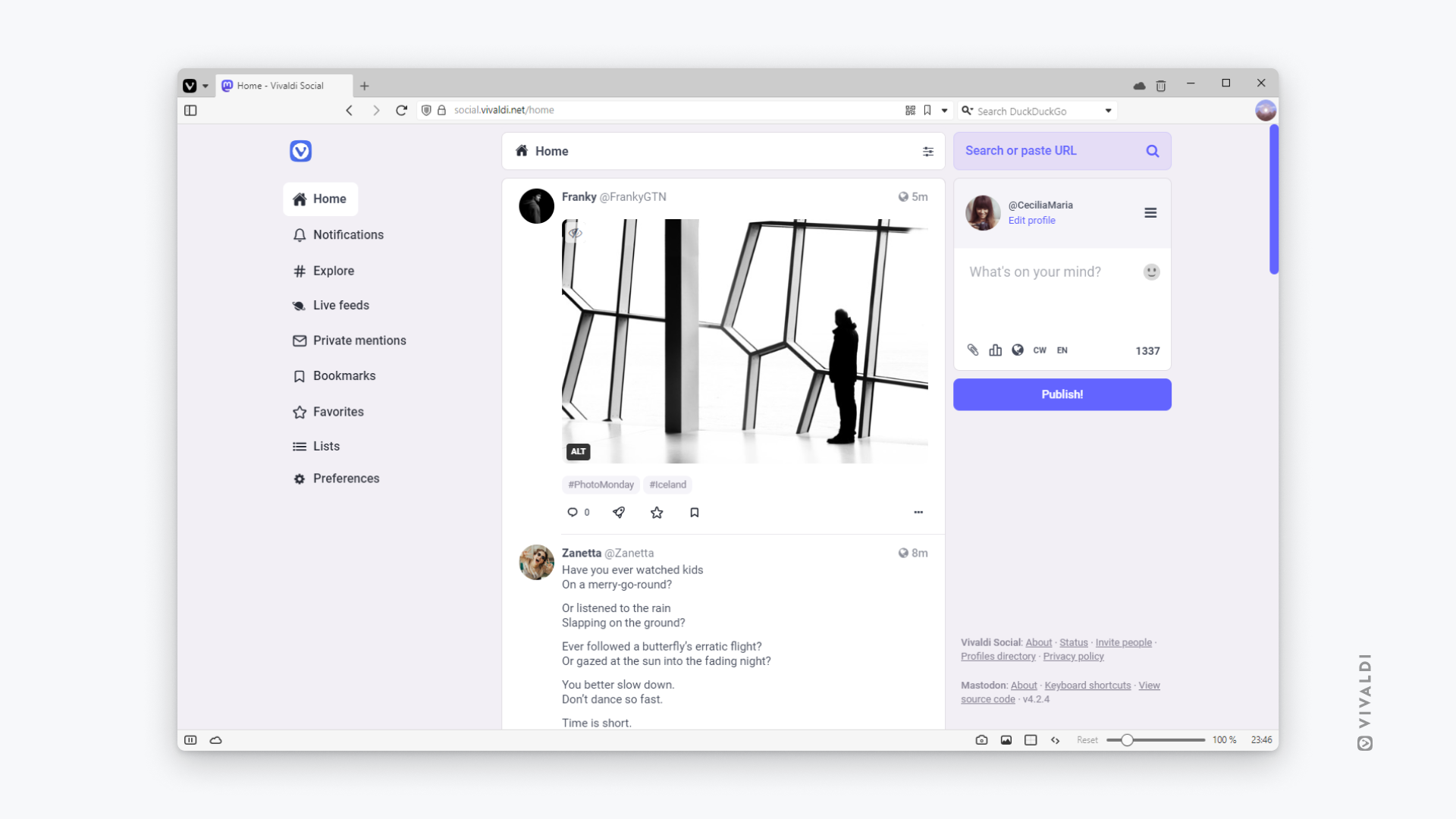
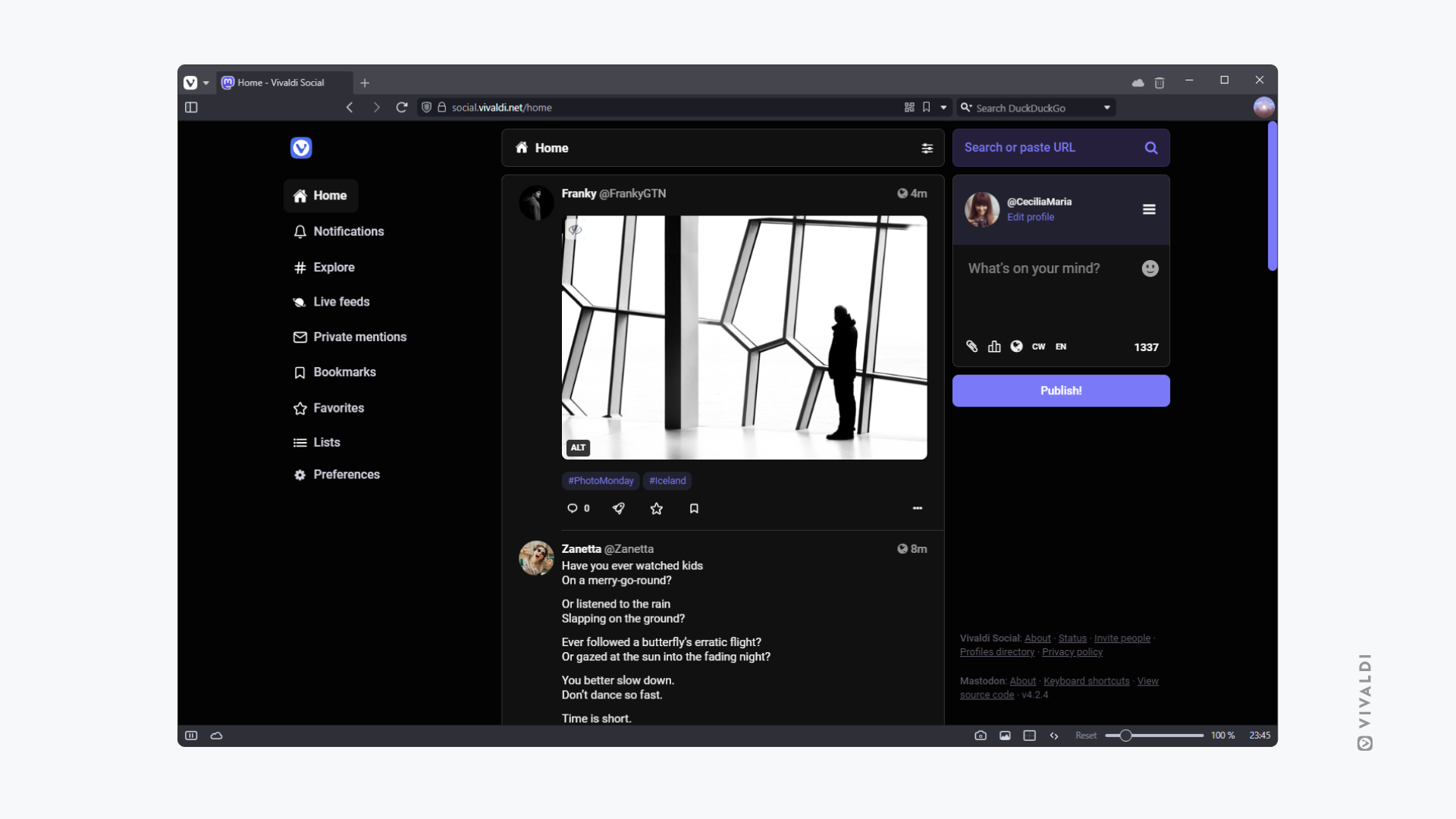
The Mastodon Bird UI theme can be set to light, dark, and at high contrast.
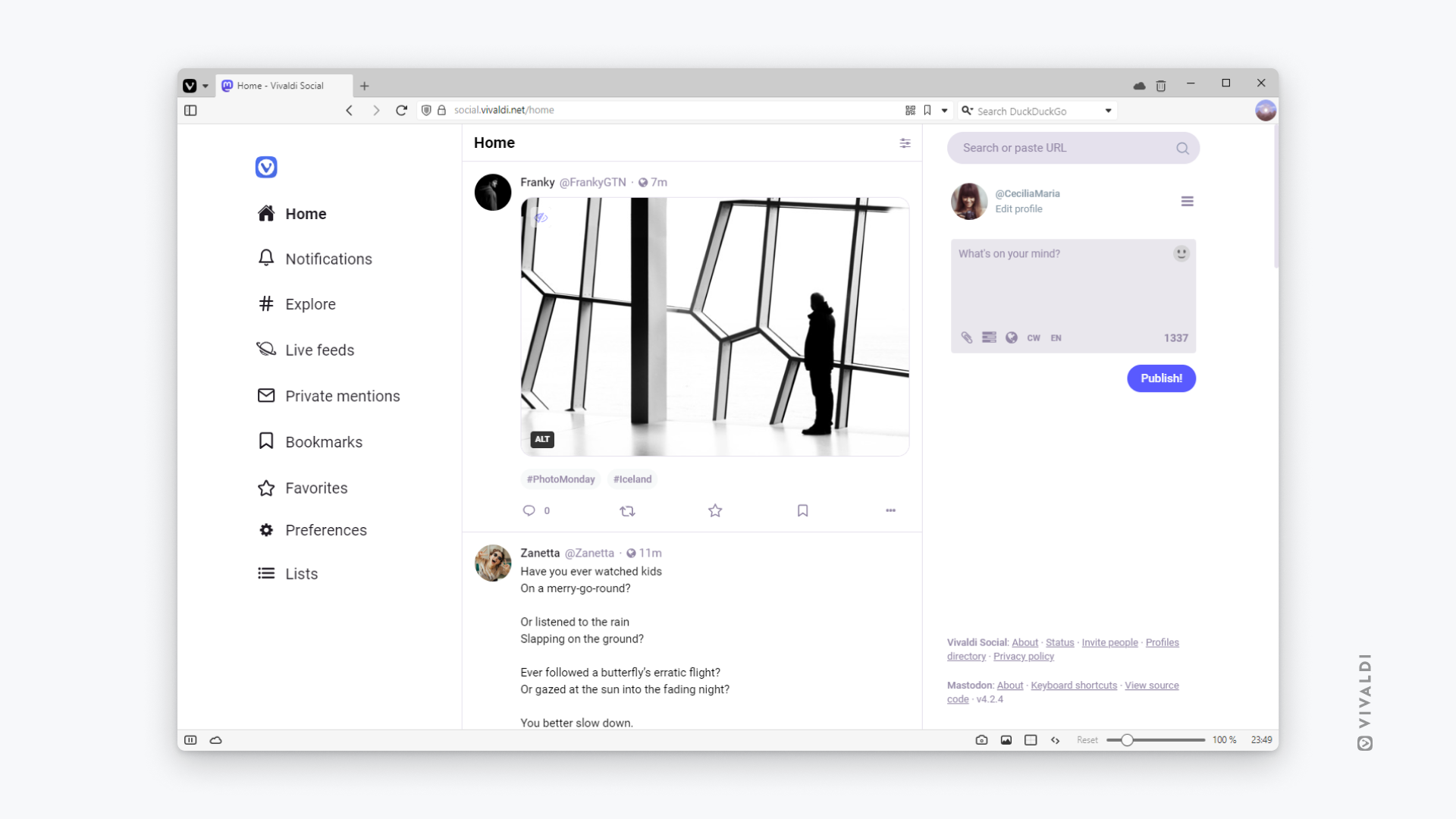
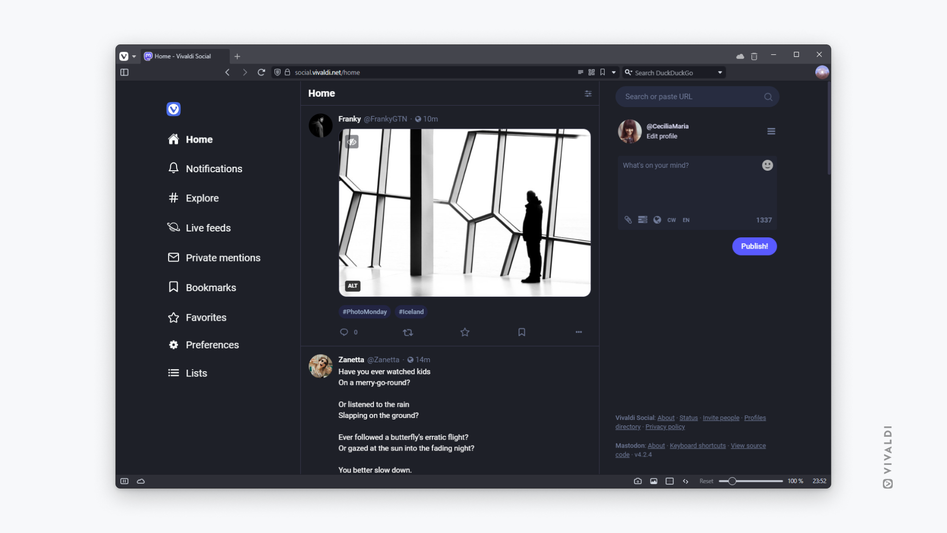

To select a new theme for your account, go to Preferences > Appearance > Site theme, to make your choice. Note that, only the front end of Vivaldi Social will be displayed in the custom theme. Preferences pages will remain in one of Mastodon’s default themes.
We’re excited to bring you these new experiences and look forward to much more in the future. If you’re new, you can easily sign up at https://social.vivaldi.net/ and enjoy the new Vivaldi Social.

