
Read this article in Deutsch, Español, Pусский.
Our mission? To inspire you to dive into our new boundary-breaking Vivaldi Themes in Vivaldi 5.0 for desktop and notebooks and start creating and sharing new themes of your own. To reach this goal, we ran our Theme Sharing Contest from December 2-13.
Our ask? That you let your creativity flow. Your response? A flood of themes in a riot of color, mood, personality and magic that have unleashed a whole new level of browser beauty.
It fell to judges, Atle, Fredrik, and Miky to review the copious amount of themes and find the standouts. There were so many to choose from, it was hard going, but they eventually came back with a top 10 and 2 honorable mentions.
It was really hard to pick just 10 from the collection. Some themes have beautiful images, some are plain fun (e.g., schedule the French Fries theme at lunch time).
A common thing among the themes we selected is that all are legible, have enough contrast, and an image that doesn’t interfere with the foreground.
Judge Miky
But now the judges decisions are in, so let’s take a look at the winners!
Top 10 Themes
Happy with Viavaldi
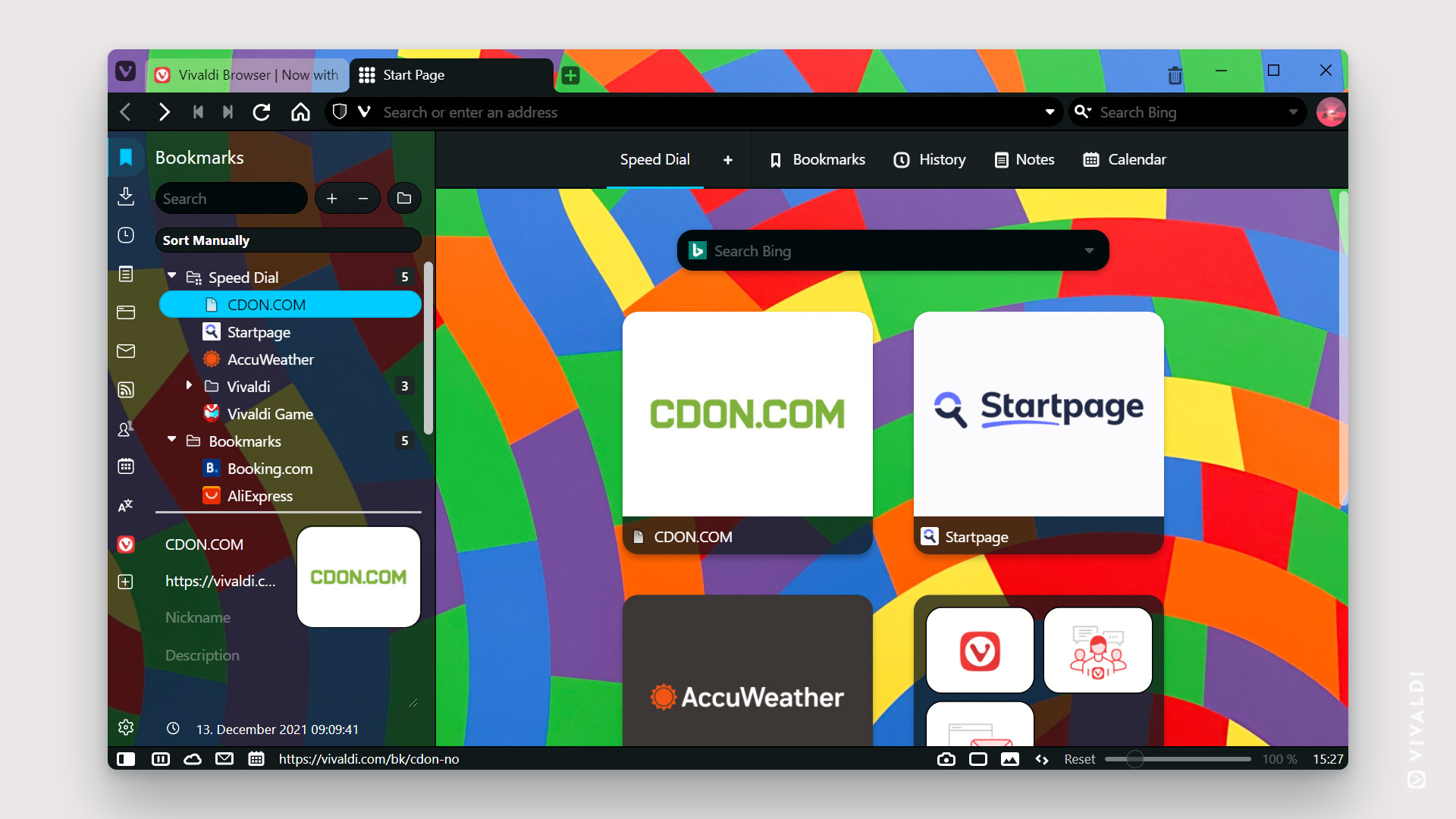
This theme was created by ikarun, who invites you to “feel the happiness with vibrant colours”.
V Tribute
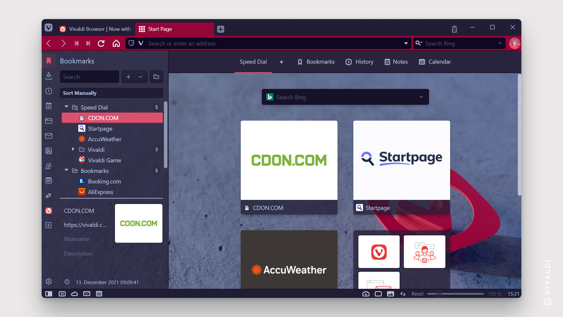
This theme from Buak offers “a dark look with a Vivaldiesque background”.
After Glow
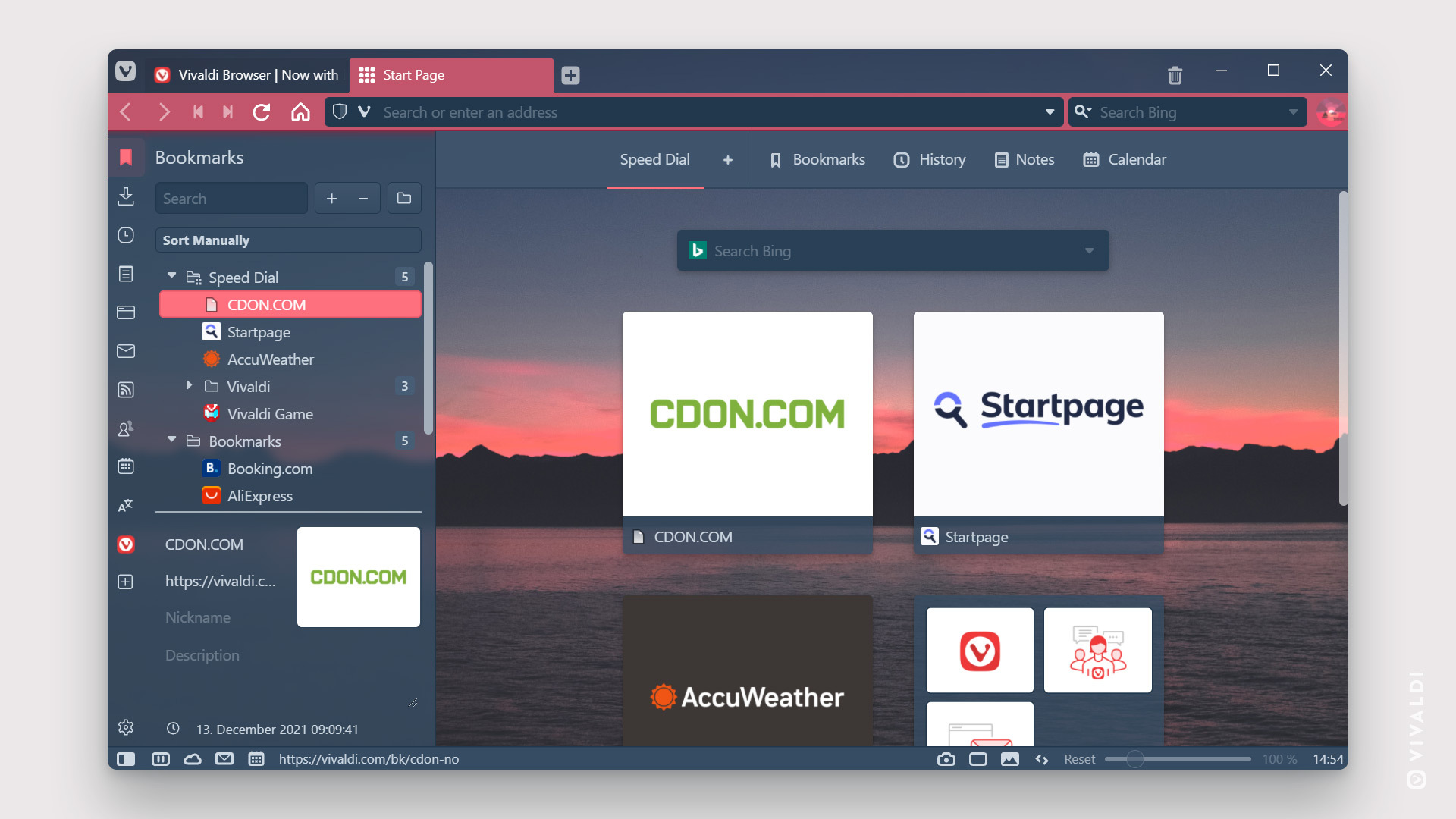
Nomadic describes this theme as “dark enough to not be blinding, but still has some fun colors”.
Suits blue
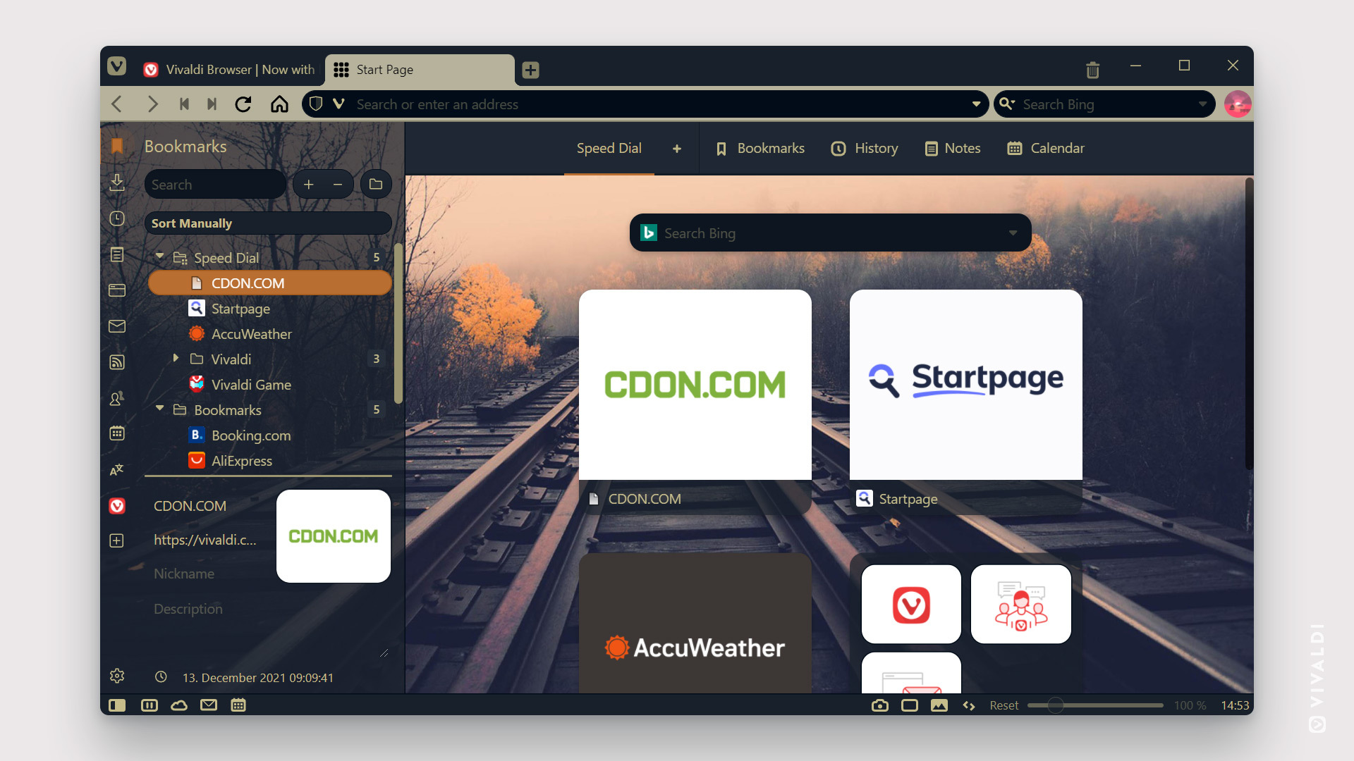
This theme from uploader 谷川 provides “a relaxed atmosphere”.
A winter fairy tale
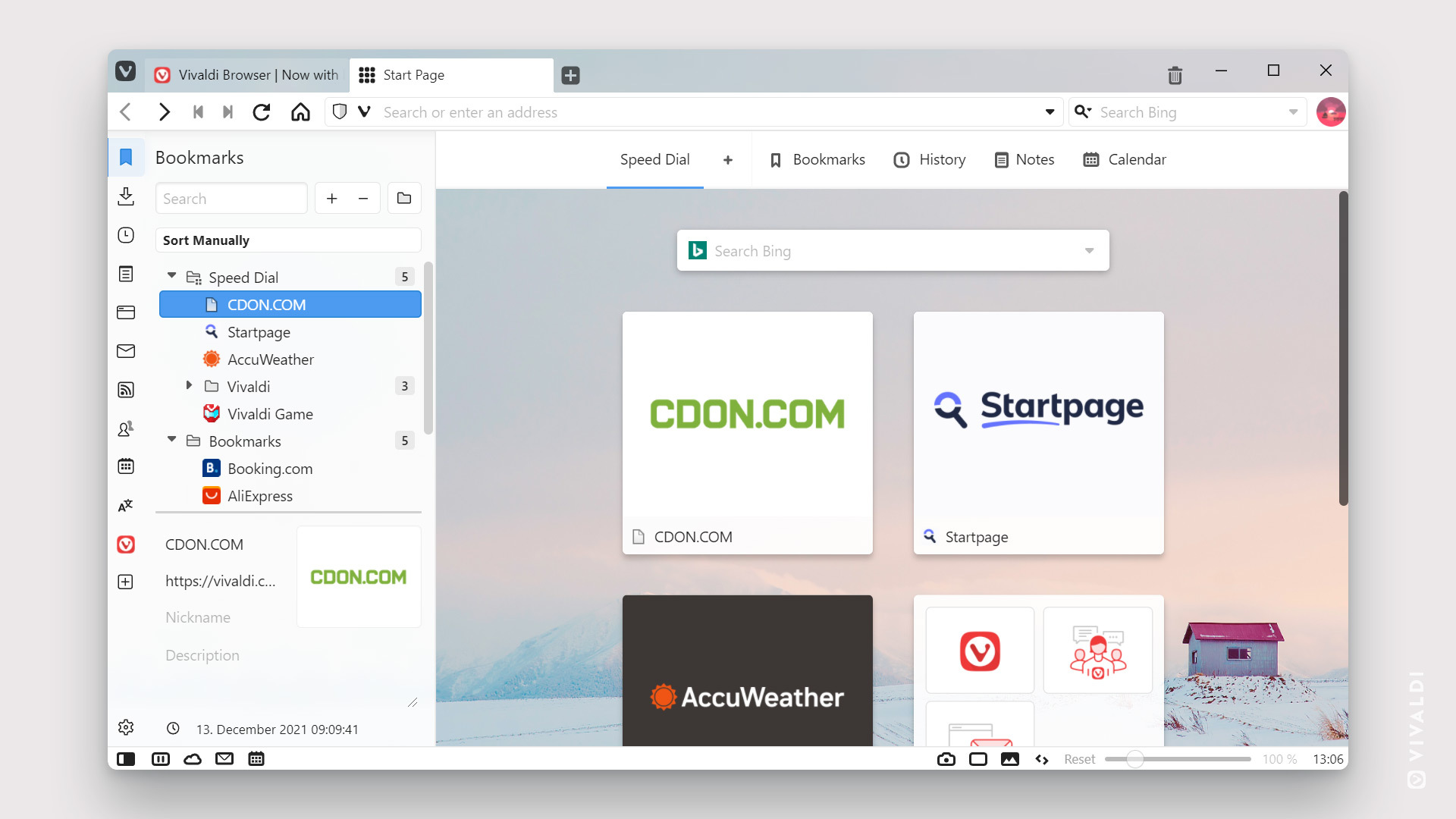
Pedro678 submitted this theme that “characterizes the beauty of winter and winter days”.
Firewatch
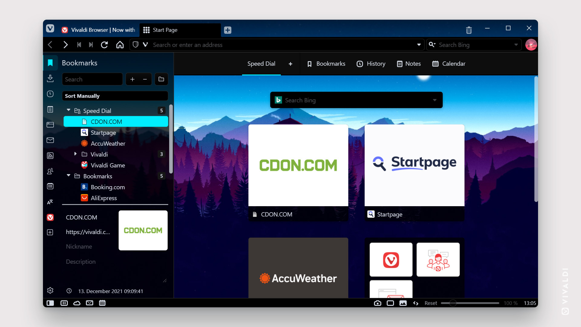
Lege4d based this dark but colorful theme on an image credited to spanks at Wallpapers.com, featuring an illustration of the Two Forks Lookout Tower, which appears in the Firewatch Adventure Video Game.
Berry Fruitty Sunset
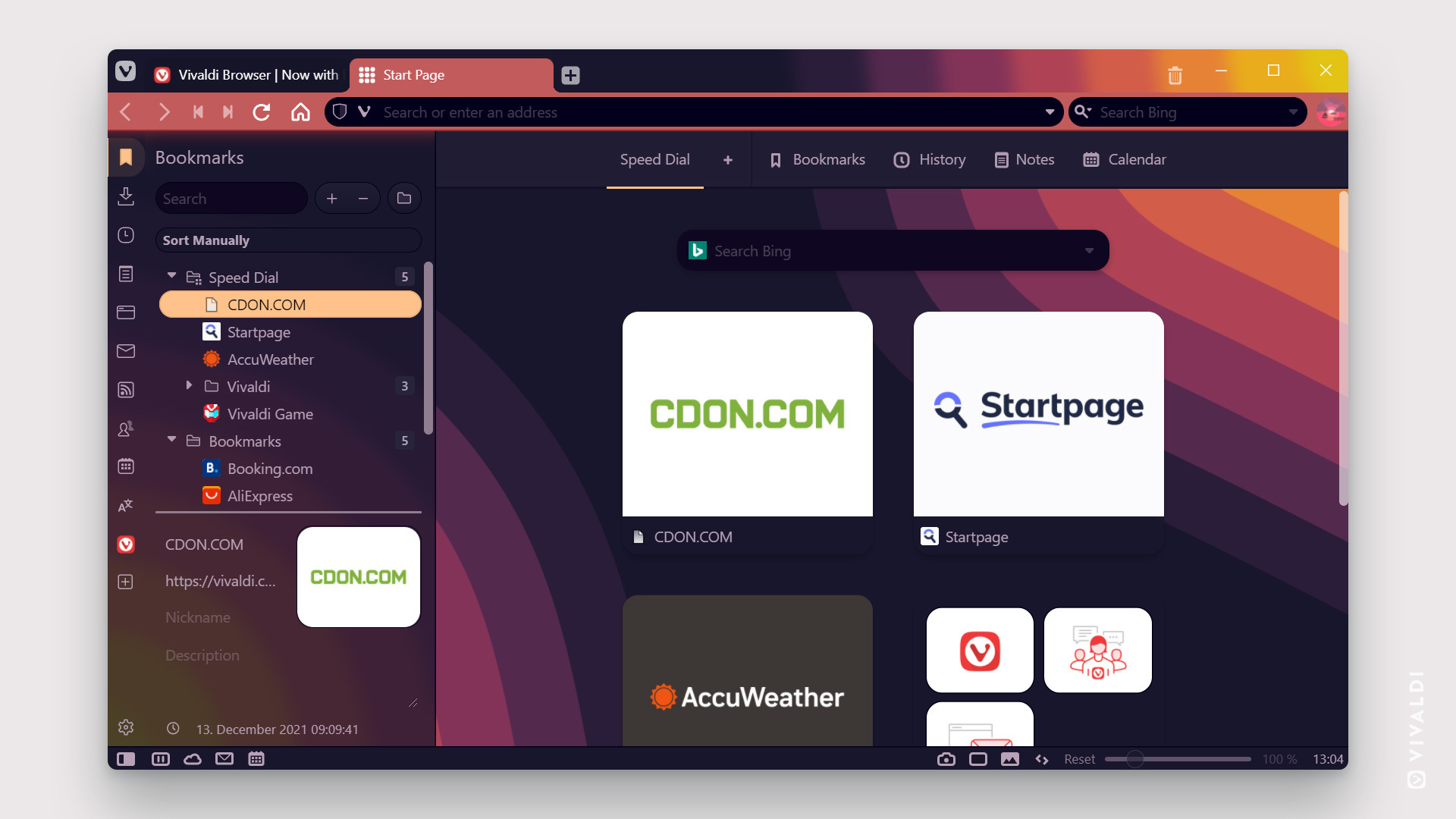
Inspired by After Blue from lupspie, jeanravenclaw created this “refreshing, contrasting dark theme with a berry twist”.
Calming Nature
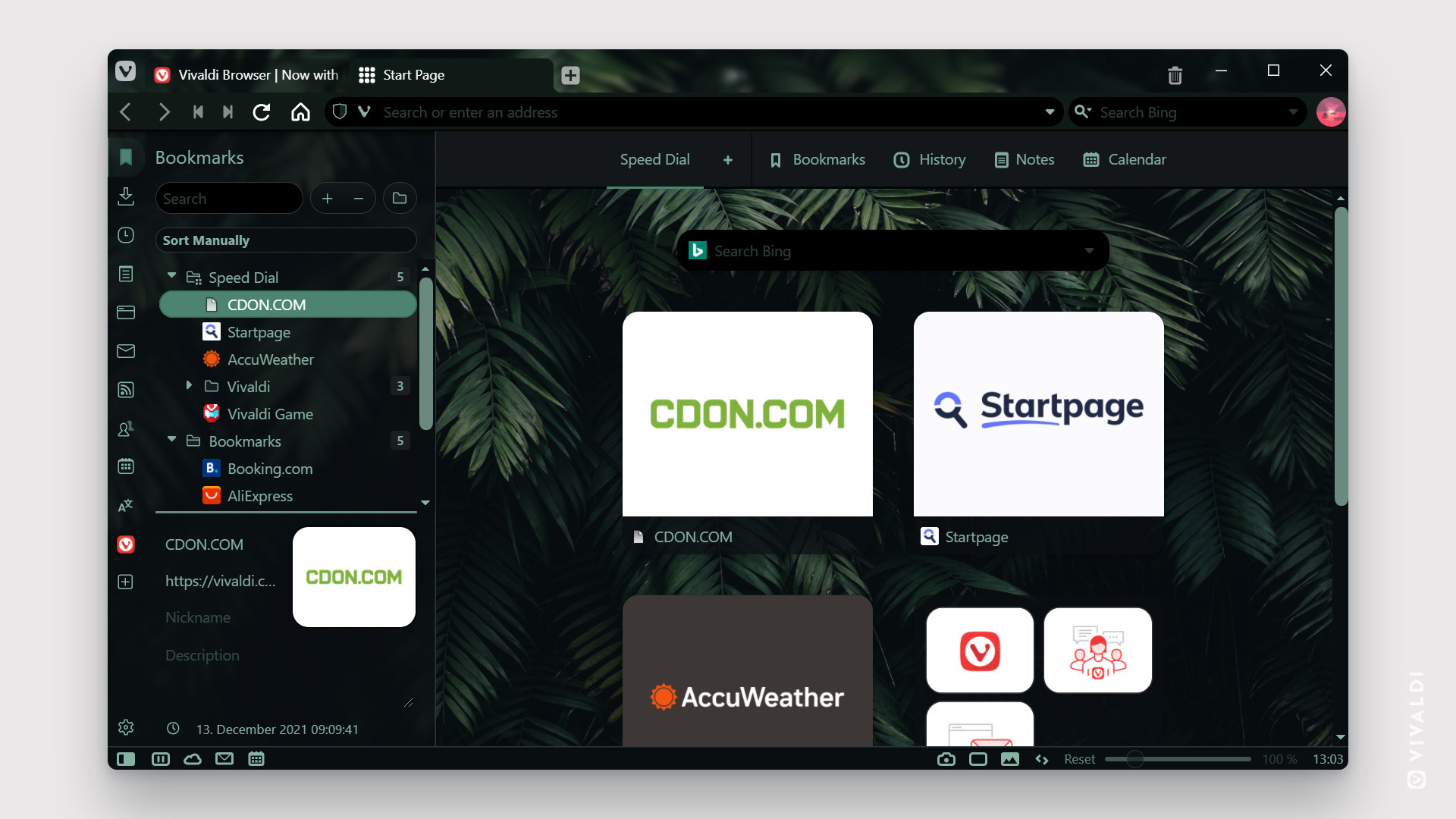
Minkuh invites you to “Let the beauty of nature calm you down” with this theme.
Rosé Pine Dawn – Rose
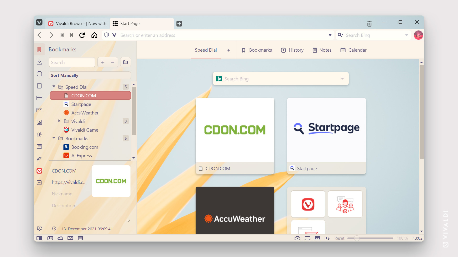
Based on https://github.com/rose-pine/rose-pine-theme, Sev delivers “an elegant and floral light theme with a pink accent”.
Cyberpunk Vibes
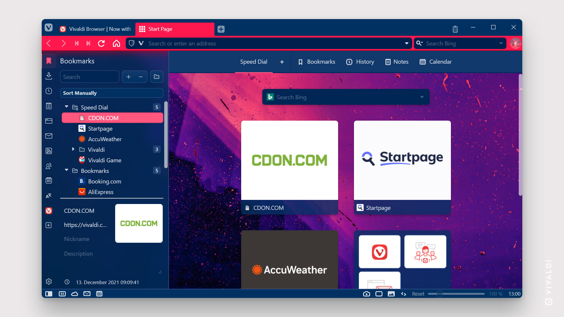
For his theme, Nico asks, “Can you feel the binary Neon vibes?” And the judges replied “Yes, we can!” The background image is from Unsplash.
Honorable mentions
The judges also wanted to recognize the following themes:
Improved Readability Color Theme, for those with or without Dyslexia (i.e. everyone)
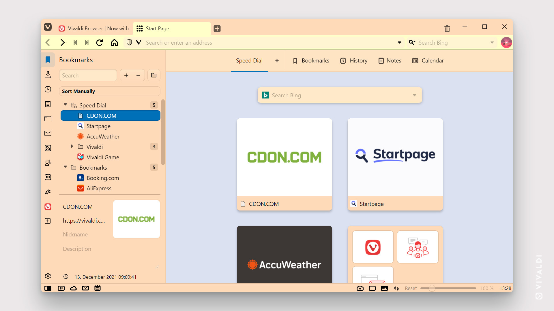
benrichards based this theme off a research paper: “Good background colors for readers: A study of people with and without dyslexia” from Rello, Luz, and Jeffrey P. Bigham.
Ship Without a Sea
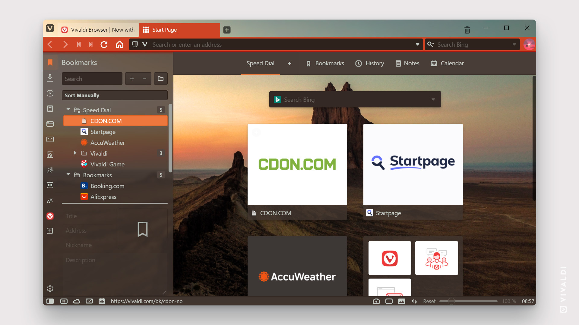
This theme, the second from Nomadic among our finalists, features relaxed, calm colors, while highlighting Beautiful Ship Rock in New Mexico, USA.
It’s an impressive lineup, and we extend our heartiest congratulations to the winners, as well as our sincere appreciation to all who participated and shared so many amazing themes. We will be reaching out to the winners about their prize packages.
But, as Judge Miky adds, “My best advice, rather than rely on our personal tastes and preferences, is to go to explore the theme archive (or turn whatever you like into your personal theme).” We do hope that these winning and honored themes will inspire you to head over to the Vivaldi Themes Gallery at themes.vivaldi.net. Check out the color, ideas and creativity on display or even create your own theme to add to the collection.
So what do you think of our judges’ choices? Please use the comments below👇 to share your congratulations with the winners – and to highlight other themes that have caught your eye during the contest.


