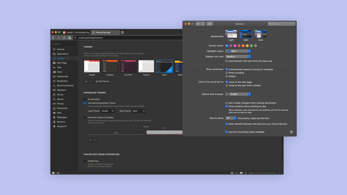
Operating systems, browsers, and apps have all fallen for dark mode and you can now go dark on most of them. Recent versions let you choose between light and dark theme, and in some cases, such as in macOS Catalina, you can even synchronize the dark theme with nightfall.
With so much press, you’d be forgiven for thinking that dark mode is better for you. You might even feel that you’re missing out on something significant.
Before you decide if dark mode is better for you, here are five things you should know about it.
What’s dark mode?
If standard interface design is about black text on white background, dark mode inverts that so that you get white text on black background.
However, dark mode is not only about black and white. It’s about making the whole screen darker. Often, dark mode uses some color or at least shades of gray to emphasize various elements on the screen, e.g. tabs, links, buttons.
Is dark mode better for your eyes?
Apple’s promotion of dark mode sparked a lot of controversy with the claim that it’s “easy on the eyes – in every way.”
Experts have come forward arguing that in most cases it doesn’t relieve eye strain and that for the average person, the more traditional black-on-white text is easier to read.
However, it can be better for you if you have low vision or are sensitive to bright light. Visually impaired people with e.g. cataract have an easier time reading white text on a black background. Indeed, dark mode is often considered an accessibility feature.
For the average user, dark mode works great in low-light environments. The dark background seems to be less harsh on the eyes when looking at a computer or phone screen in the dark.
Can dark mode improve your focus?
Based on the existing research on human-computer interaction, it’s unlikely that dark mode is better for you when it comes to focus and productivity.
In a series of studies, participants were asked to read and proofread black text on a white background and white text on a black background. They detected more errors, read faster and understood the text better with black text on a white background.
The likely explanation for this is that when the light is bright, our pupils constrict more and we see better, down to the small details. That’s even more important on a phone where the text is very small.
Can dark mode save battery?
Battery saving depends on the type of screen you have. OLED screens will benefit from dark mode as pixels on these screens light up individually. When a pixel is black (as in #000000), it’s deactivated. If your screen is OLED, expect to see very healthy battery saving.
But for the much more common LCD screens out there – which you likely have – there won’t be an advantage because LCD screens light up all pixels – even the black ones.
Is dark mode cool?
Whether you buy it or not, dark mode is one of the hottest tech trends at the moment. It makes for a nice design, oozes coolness, and is driven by aesthetics. A quick poll around the Vivaldi office showed that at least two-thirds of the devs are hooked which might just explain all the cool dark mode features in the Vivaldi browser. 😱
For example, in Vivaldi, if you don’t like the predefined dark theme, you can tweak or create a new one from scratch. You can play around with the background, foreground, highlight and accent colors. Just make sure you create enough contrast to easily tell the active tab from a tab you hover over, and the rest.
As of the last update, you’ll also find a new quirky option that makes it possible for Vivaldi to follow the theme of your OS.

Whether or not you choose to go dark should be based on your personal aesthetic preference because, with regards to usability, dark mode isn’t better for most people.
So dark mode is nothing if it ain’t cool! But, hey, we like cool things, don’t we?
* * *
Dark or light? Let us know in the comments!


