Read this article in Deutsch, Español, 日本語.
OSLO, Norway – Dec 2nd, 2021
Got a 10-incher?
Not satisfied with what other browsers do for you on a tablet?
Vivaldi has your back.
Many browsers are optimized for smartphones, not tablets. But, at Vivaldi, we take tablet browsing seriously.
And that is why we are going big on tablets, working to optimize the browser specifically for those bigger screens. Most browsers just don’t do this. So, if you’re a “bigger is better” person when it comes to screen size, make most of your tablet with Vivaldi.
Our latest update, Vivaldi 5.0, has a brand-new, super flexible design – including a side Panel – to optimize your screen space better on tablets and Chromebooks.
Unlike other browsers, Vivaldi’s interface on a tablet is styled to stand out with features such as real tabs, sync, built-in note-taking, optimized landscape and portrait mode browsing, built-in Tracker and Ad Blocker, Vivaldi Translate, and (introduced in today’s version) Two-Level Tab Stacks.
The Big Bang on your tablet: Make the most with Vivaldi.
The user experience on tablets and phones is different. A great Android tablet browser should be designed with large screens in mind. A bigger screen opens up a lot of possibilities for how the app’s user interface (UI) is presented. And that is why we have put in a lot of love, care, and attention to make Vivaldi on tablets and Chromebooks just right for you!
Introducing built-in Panels, a first in tablets.

One thing that puts Vivaldi ahead of other Android browsers is its first-of-its-kind, unique UI. And now we elevate it with a brand-new, super flexible design for you.
Enter the Panels.
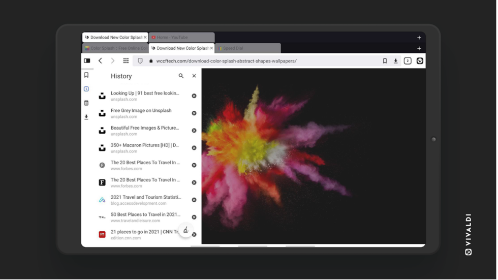
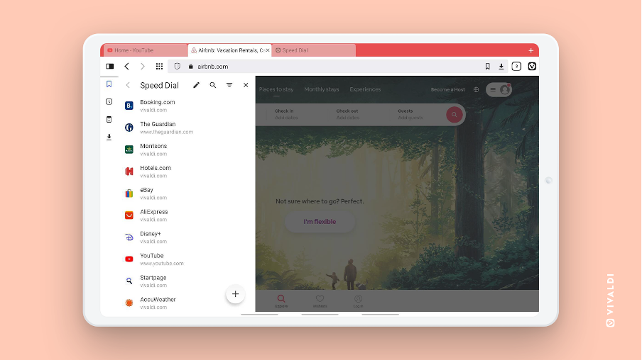
With Panels, you can optimize the available screen space on tablets and Chromebooks. Key functionality is all just a tap away.
Panels now pop up on the left of the screen, just like the default desktop configuration, to give you that familiar feel.
Now, you can keep your go-to tools within easy reach in the browser’s sidebar. Work with your History, Downloads, Bookmarks, and Notes in split-screen with your main browser window.
Toggling the Panel on and off is as easy as tapping the panel button in the top-left corner of the location bar. This makes better use of the screen space and facilitates more efficient workflows.
Panels mean possibilities. Open dialogs to add, edit and move Notes and Bookmarks around directly in the panel. Open and edit Notes in full screen! Change download settings and clear your browsing history. Quickly track down a Bookmark and open it in a new tab, so you can organize your workflow from the panel directly.
Feel like you’re missing out on something? Put that big screen to use for once.

In mobile or tablet browsing where every pixel matters, screen space is at a premium. Combining brains with beauty, Vivaldi’s functionality has been designed to suit tablets – and tablet users:
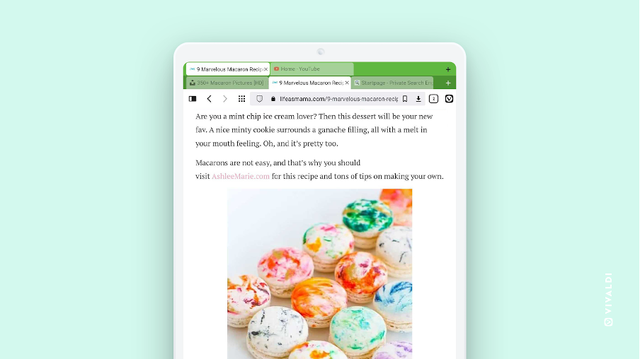
Real, desktop-style tabs: This makes browsing great, making it easier to keep track of open tabs. Of course, you can also use the Tab Switcher (on the right side of the bottom toolbar) to access and manage your tabs too.
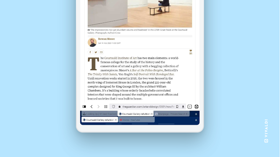
Two-level Tab Stacks: Another first in browsers, the double-decker browser tabs is a solution that will eliminate your tab woes. So if you’re already hoarding tabs on your Android, Two-Level Tab Stacks will likely make your life a whole lot easier, keep your screen tidy and feel organized in the face of tab overload. Tabs inside a group will show in a second row, but they’ll stay hidden when you don’t need them.
Movable Tab Bar and Address Bar: Just like in Vivaldi’s desktop version, the Tab Bar and the Address Bar are configurable. Take them to the bottom or top, any time you like, and keep these key touchpoints within easy reach.

More screen space: The System Status Bar at the top can be enabled or disabled. Even though it is part of the Android UI, Vivaldi can display the browser window over it (a bit like enabling “full screen” mode).
More room: The new tabbed interface is not only striking but allows you to play around with more screen space. This includes smaller tabs for faster access to tabs. By removing the close button on all but the active tab, each tab can become as small as the favicon.
Landscape mode: Unlike other browsers, we have a carefully designed, intuitive user interface for both portrait and landscape modes. Landscape mode comes with greater width. When the browser is flipped in landscape mode, it will not look like portrait mode. For maximum space – and easy access – the toolbar at the bottom is removed and buttons moved to the top.
Dark mode browsing: If you are a dark mode fan, you can now enable/disable dark themes for any webpage from the Settings that will show a ‘Dark theme’ menu. Simply head to Settings-Theme-Dark mode for Web Pages.
Privacy first: An integrated Ad and Tracker Blocker shuns intrusive ads and helps web pages load faster. Vivaldi Translate allows you to translate webpages and text in the browser out of reach of Big Tech’s prying eyes. You can also sync browser data between devices with end-to-end encryption. And of course, Vivaldi also doesn’t track you.
Get your tablet on! And download Vivaldi 5.0 for free.
Vivaldi 5.0 is designed to stand out on Android, whether you use portrait, landscape, or tablet mode. But we boost the beauty beyond skin deep by packing in ground-breaking features and flexibility. So you can do more, have fun doing it, and make Vivaldi on Android. truly your own personal browser.
Grab the latest version of Vivaldi on your Android.


