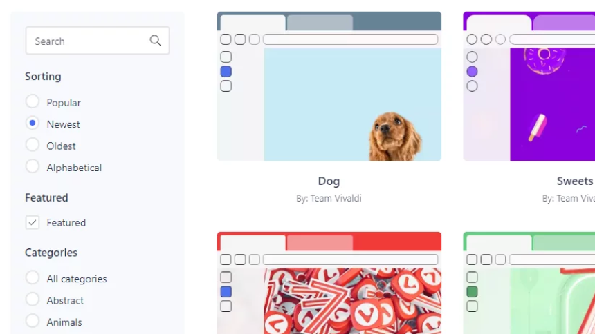
This week, we launched the update of our Vivaldi Themes site. Now, you can filter simultaneously by category, color, featured themes, and theme-name text search. And you can sort the results alphabetically, by popularity or by recency.
Work on the update began about a month ago, after a colleague reached out to Sysadmin Thomas Pike about the site:
Hey. When filtering themes only one filter is applied at a time, right? Either category or color. I can’t look for Space themes in the color blue. Possible to implement the option to apply multiple filters?
Thomas explained that it was definitely possible, but it would require an extensive reworking of the user interface for the Vivaldi Themes site.
This presented several key challenges. First, the filtering logic would need to be compatible with the site’s navigation structure. There would also need to be drastic changes to the UI, transitioning from a couple of drop-downs to a proper search form. And finally, just to keep things interesting, the UI needed to be immediately responsive, which introduced more complexity.
Challenges accepted! To read about how Thomas and our designer Fredrik Andersson worked through them, head over to his personal blog post Updating the Vivaldi Themes website on Vivaldi.net.
To see Vivaldi Themes in action, check out this video:
We’re excited about these improvements and hope you will enjoy the revamped site! Let us know what you think in the comments here or on Thomas’s blog.


