
One of our core beliefs at Vivaldi is that users want to customize. It is also one of the reasons I enjoy working for Vivaldi. To me, our users are also designers. With Vivaldi, they should be able to express themselves. To set it up just right. There are many ways to do that. But moving buttons around in the UI had not been possible. Until now.
With Vivaldi 2.4, we are changing that. For the first time in Vivaldi history, a button can exist in more than one location. The new buttons have new features that we will harness to build new and better experiences. Accessibility support is built-in, as is support for badges, “on states”, menus, pop-ups, and drag-and-drop.
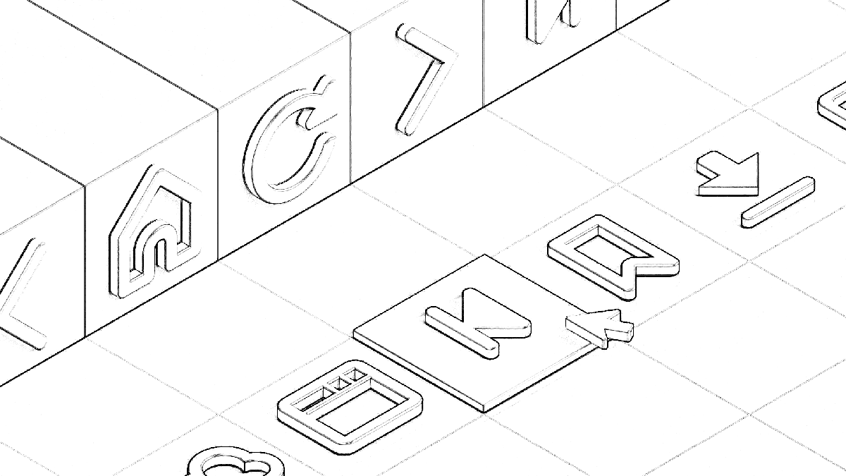
We also spent time re-thinking and re-drawing toolbar graphics (my design colleague Atle will share more on how those were made next week). We decided on three sizes and with the updated Toolbar component the buttons now switch to the correct size as necessary.
Rewriting everything
Those of you who have been using Vivaldi since the beginning, know that we started out as “a browser for our friends”. We built the foundations piece by piece, with feedback from you. I don’t think anyone on the Vivaldi team back then thought Vivaldi 2.4 would look and feel as it does today.
That journey resulted in many bespoke pieces, designed and built by different people. Early Vivaldi components might have a coherent design, but the logic underneath would often be very different. Using web technologies allowed us to build things fairly quickly. The result of that was (amongst other things) a large collection of unique buttons.
With unique buttons, allowing them to exist elsewhere in the UI meant adding logic and design. Multiplying the possible combinations yields a number fast approaching infinity. The humble Vivaldi browser design team consists of three people, so complexity had to be managed.
I decided that a wrapper for our buttons that could be predictably styled and interacted with was worth building. My colleague Petter had already built a Toolbar component that could render different buttons, so it shouldn’t be so much work, right?
About half a year later, I now know I was slightly off the mark. It has been a substantial amount of work, especially as it was run in parallel with the main development branch. Once my changes were merged onto the main development branch there was no time to rest. I got reports of about fifty things I blew up!
The component
The Vivaldi browser user interface is built upon the popular React framework. In React parlance, components are independent, reusable pieces.
The goal of writing a button component was to make our toolbar buttons predictable and consistent. To avoid losing functionality, or regress, it would have to support a superset of all our button features. When I started out I imagined that list to be reasonably short. What I discovered is that (surprise) we had a wide variety of buttons — and sometimes different ways of doing the same thing.
The basics are quite simple. A button should be able to have a title or a graphic. And clicking it should trigger an action.
Of course, it quickly gets more complex. We allow buttons to trigger a menu, like the Trash button. Some buttons have both an action and a menu, like Back. Here we support both context menus, long-press. I added a third way of accessing the menu, by pressing Down Arrow when the button is focused.
Speaking of focus, the new component is built so it will not receive focus when pressed. The focus-jumping nature of HTML buttons is perhaps what I like the least about them, and the more precise focus handling in the new component is perhaps my favorite feature.
Above I mentioned action and a menu. But there are so many other features that were added. Like a pop-up. Secondary actions for middle- (or option-) click. Overlaid badges, drag-and-drop.
Drag and drop
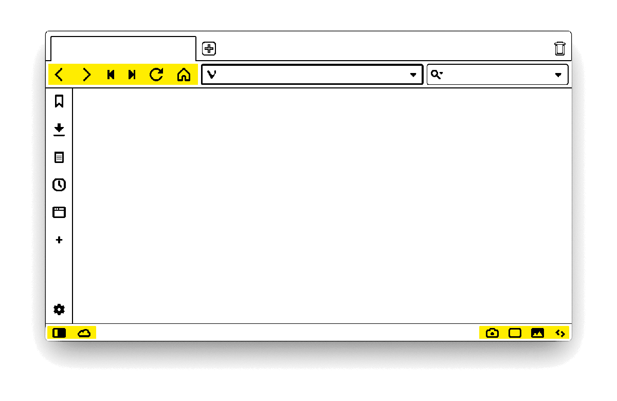
Vivaldi 2.4 comes with drag and drop support for the Address and Status Bar buttons. To move a button a modifier is required, currently the Shift key. When a button is dragged we subtly highlight where it can be dropped.
Enabling drag-and-drop requires precise handling of events. And as I think anyone who has worked with it will say the same — it is not a great pleasure to work with. But in the end, it worked out, and I even got to do some fun things, like creating custom drag images.
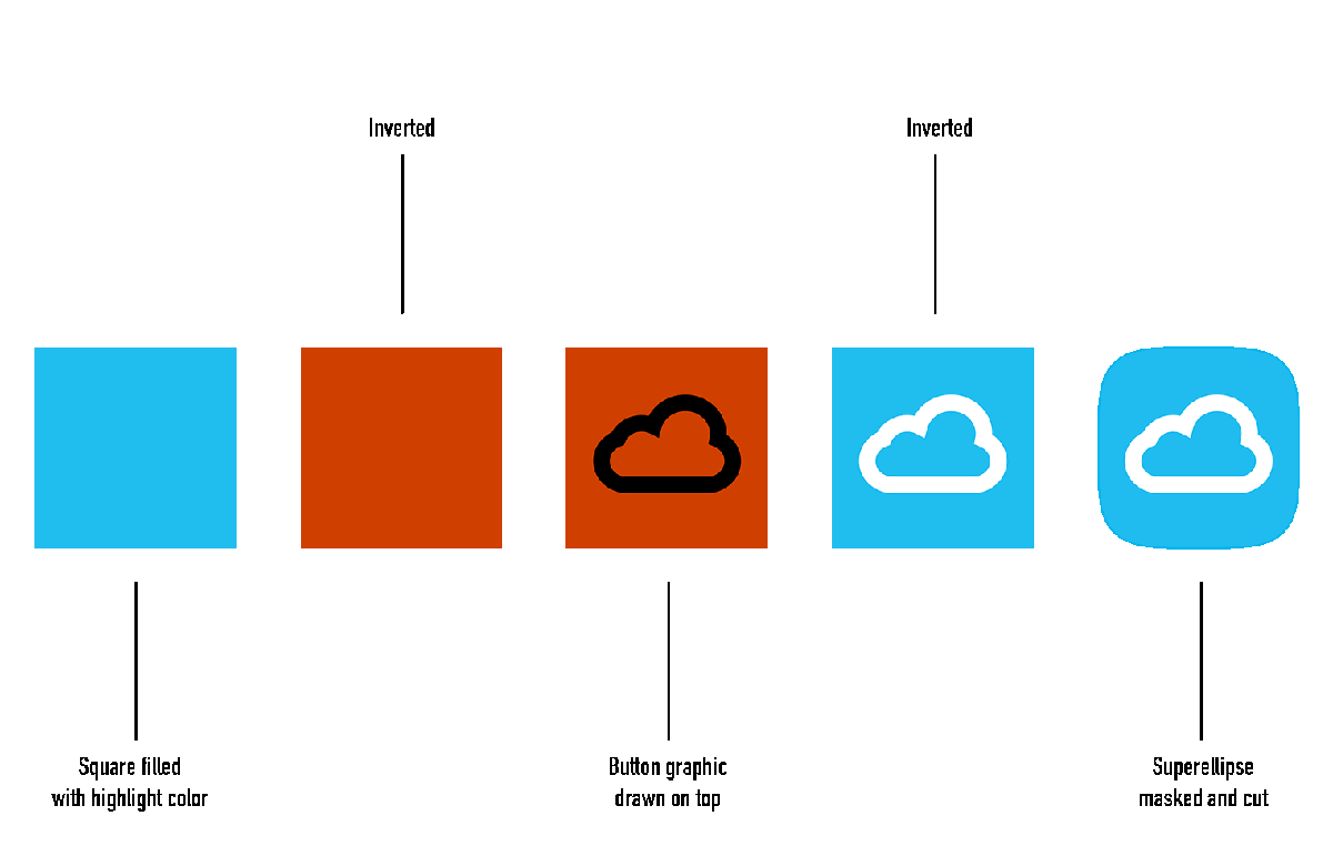
The drag image
With web technologies, the system will create a drag image, using a screen capture of the element you are dragging. For buttons that meant using the pressed state, which looked a little odd.
My colleague Atle has long been a fan of the superellipse, or squircle shape. I immediately knew that was what we would use for dragging. Having it follow the theme colors would be a challenge, as the base vector asset without any styling is black. Which meant some cleverness was required.
When creating the drag image, Vivaldi performs the following color dance:
- Fills a canvas with our highlight background color
- Inverts it by painting white on top with difference blending
- Draws the vector on the canvas as-is
- Inverts again
- Draws a superellipse cutout and clears the outside
Step by step
So while buttons support drag and drop, not all buttons are draggable. Even for toolbars that do support drag and drop, only buttons are draggable. So why share this with you now? Why not disable the functionality until it can be enabled everywhere?
I think this comes down to the essence of our philosophy. Jon has always encouraged us to build things and get them out. By sharing work that is still underway it encourages feedback and discussion. And it allows us to make changes and adjust.
All the small things
I hope you enjoy Vivaldi 2.4. There are many details not described here, even some invisible ones. If you discover an interface detail you like or have something on your heart after reading this, let us know in the comments below. If you see something that’s not right, head over to vivaldi.com/bugreport and let us know.
Thank you for using Vivaldi!