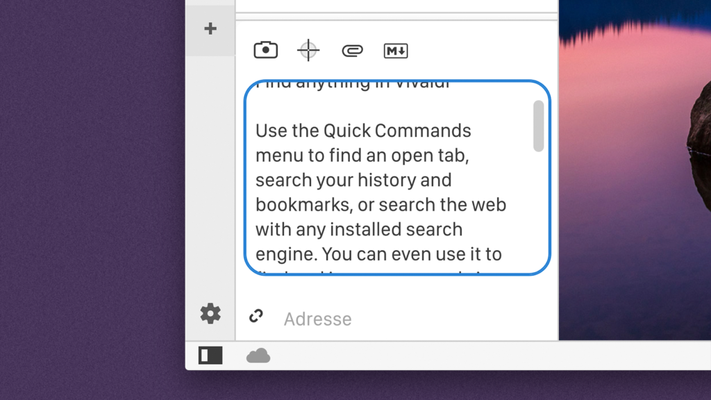
One of our recent Snapshots improves scrollbars in our UI. We draw them ourselves instead of using the system ones, as we want to support theme colors.
Styling scrollbars is a little tricky since they hide in the shadow DOM. On Mac, the scrollbar would be painted on top of the border surrounding text areas. When their corners were sufficiently round, they would clip it.
Due to the limited styling options for scrollbars, it is not possible to set the width of the drag handle (called thumb in CSS). We worked around this limitation by letting the border be the same color as the background. We can set the border to be transparent, but that will defeat the purpose, as the background will be extended and painted in place of the border.
The solution we ended up with is using the CSS property background-clip, which lets us clip the background to where the border starts. We use this in a couple of places to achieve complex designs without additional elements. The result is properly rounded scrollbars on Mac.
On Windows and Linux, the scrollbar buttons (up, down, left and right) are now rounded as necessary — to not clip the text area borders. This Snapshot also added in missing buttons for horizontal scrollbars. We try to prevent horizontal scrolling, but when we have to scroll, there should now be proper buttons.
This post was originally published on Henriks’s personal blog on Vivaldi.net on August 5, 2018. See original post.


