For every page you visit in Vivaldi, a color is selected. Currently, the engine takes two types of input — a favicon and meta theme-color.
The ten most frequently used colors are extracted from the favicon, resulting in a list of up to 11 (including theme-color). They are then rated by the following criteria:
- Is the contrast good enough?
- Is the color a midtone?
- Is the color saturated?
A perfect score here is not very hard to get and will give a color 150 points. Additionally, the top three colors are given a bonus multiplier. After all, it means they occur more frequently in the favicon, so they are more likely to be relevant. If present, the theme-color is given an additional bonus.
The winner is the color with the highest score. Changing the Vivaldi theme or contrast requirements can impact which color will be chosen. In practice, the theme-color will win, unless it is a bad match.
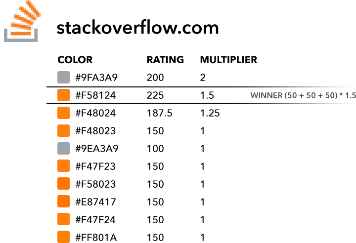
Here is an example of how this works in reality. Note there is no theme-color, so the most frequently occurring color receives a 2x multiplier. Still, it manages to lose to the second most frequently occurring color, as that one receives additional points for saturation. This is a good example of why saturated colors are rated higher.

Here is an example of what happens when the page author has specified a theme-color. It receives a 3x multiplier and wins over favicon colors — by a wide margin.

This post was originally published on Henriks’s personal blog on Vivaldi.net on August 16, 2018. See original post.


