Read this article in 日本語.
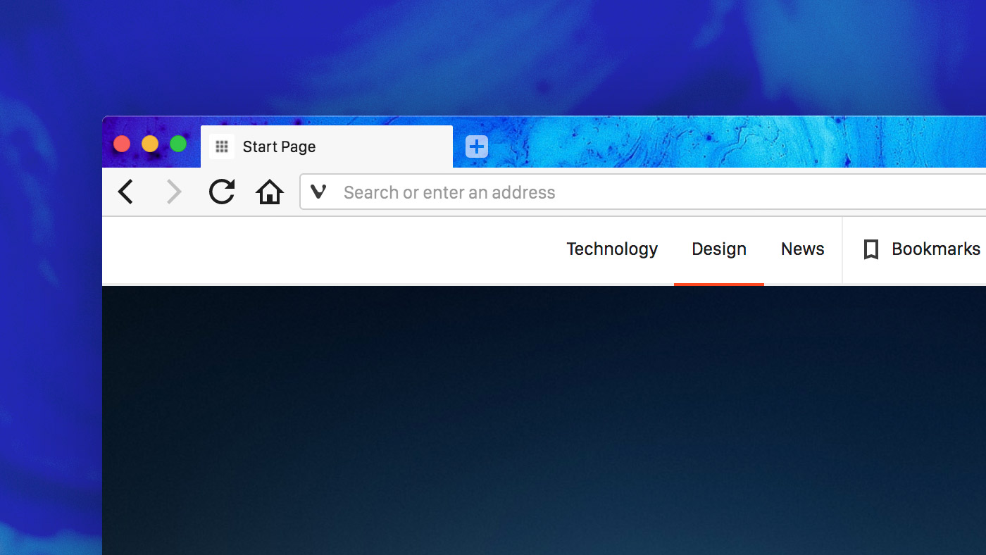
As a designer, what I love about Vivaldi is the seemingly endless possibilities to customize the interface. Now we’re adding even more choices with the Window Background Image setting we just introduced in Vivaldi 1.15: Just Better. That’s fantastic, but there are some things to keep in mind when you can tweak that many aspects of the UI (User Interface) – I’ll try to show some “best practice” examples, and give you some patterns and images to get things going.
Let me add that I’m slightly more than average interested in patterns and textures. So much so that I ran a dedicated blog on the subject for 6 years. It was called Subtle Patterns, and it still exists even though it’s changed slightly after being acquired, but it’s still a great resource to get patterns to use in Vivaldi.
60 seconds of history
Traditionally in UI design, textures, shadows, and depth were used to create a sense of realism – mimicking its real-life counterpart to give a sense of familiarity. A button would be sticking out ever so slightly (using shadows) to give you the impression that you could “press it”, the same way you would a physical button.
Remember the first versions of Apple’s iOS – they took this to new extremes, where they had wooden shelves for the iBooks, a paper & leather textured notepad, a realistic rendering of a microphone for the voice recorder, and all this so people would quickly understand and feel at home with the application’s intended use.
Now, in Vivaldi, we don’t rely on textures and depth to this extent. Shape, size, and color are usually enough to convey meaning and intent. But, adding a bit of flare and personal style to the product you use every single day is a good thing, right?
I have split it into three categories: Patterns, textures, and images. Let’s get to it.
Patterns
For this initial release, we shipped with a Japanese Sayagata pattern, made by Olga Libby. I toned down the contrast and used grayscale colors to make it easier on the eyes. This way, it can be used as is, or my favorite way: with the “Blend Accent Color from Window with Image” option enabled. This works very well on a theme like Redmond.
You’ll see that it now blends on top of the current Accent color of the page you are viewing, but the pattern is still visible. Technically what we’re doing to achieve this is using something called a Blending Mode, specifically one called “Multiply”.
This multiplies the luminosity of the base color by the blend color, or pattern in our case. The resulting color is always a darker color. White produces no change, while the black remains. There are different levels of darkening depending on the luminosity values of the blend layer. Don’t worry, Vivaldi handles this for you.
Here are some examples of repeating patterns
These are all blended towards a fitting background color to simulate what it would look like in Vivaldi:
Sayagata – Download
Pixels – Download
Symphony – Download
Triangles – Download
Textures
Want to bring back the glory days of Skeuomorphic UI’s? Now you can! Bring on marble, leather and paper and everything else. As with the patterns, textures also work really well with the blending mode enabled. Experiment and see what works best for each texture.
Here are some to get you going:
Concrete Wall – Download
Leather – Download
Marble – Download
Wood – Download
Photos
This is a little bit different. Again a matter of taste, but I usually disable the blending for photos. That said, there are many cases where it works really well. One trick is to enable the blending, and then pick an Accent Color close to the dominant color of the photo. That way it will blend in very nicely with the UI.
Also, try out the “Transparent Tabs” setting when using photos to reveal more of the actual photograph. Try to pick a calm photo without too much heavy contrast and objects wanting attention. Remember if you have the tabs on top, only the top 40 pixels of the photo will be shown.
Pro tip: Photos from sites like Unsplash tend to be really large. You can use an online resize and cropping tool like imageresize.org to resize the image and crop out just the part of the photo you like. This will also give you a small performance gain.
A frozen adventure by Oscar Sutton – Download
Mermaid Fire Opal by Sharon McCutcheon – Download
Paint and swirl by Joel Filipe – Download
Woodstack by Semenov Ivan – Download
Bonus, a purple gradient – Download
That’s it for now. I really hope you enjoy this new level of customization. I’d love to see what you come up with, so please share screenshots of your own creations in the comments below!

