The collection of links that constitutes an app’s menu may seem like a negligible thing but can hold the key to positive user experience and usability.
When it comes to navigation menu design, different applications present different problems, and each requires a unique solution.
We’re no different.
In Vivaldi, you have a lot of freedom in how you choose to view the menu – as a single icon, or horizontally across the top of the browser window. You may even choose the menu style icon, adding more flair to your menu design (Settings > Appearance > Menu).
Recently, we revisited our menu and saw the need to enhance its usability to better suit the evolving needs of our users. Here’s what inspired us.
Listening to our users
Browsing is about navigating from one place to another, accessing information and functionality as quickly as possible. In doing this, every person has a unique workflow.
But there’s a sizable group of Vivaldi users out there who are very much “hands-on-keyboard”. They rely on the keyboard for everything! That comes as no surprise. We have a pretty comprehensive suite of built-in options, including Quick Commands as well as the option to set up your own keyboard shortcuts.
If you are one of these people, you’ll know that a crucial way to get around is using the menu bar. That’s the reason we put some serious work into making the menus even more useful.

Prioritizing features
Just recently Google decided to clean up the right-click menu in Google Chrome. It removed New tab, Close other tabs, and a bunch of other options. That’s the exact opposite of what we’re doing with Vivaldi. True to our philosophy, which is all about tweaking the browser to your needs, we expanded our menu settings.
It has been shown time and time again that people tend to pay the most attention to and engage better with information that appears at the top of a web page. The menu is, therefore, a good place to keep important links.
The starting point for our navigation menu redesign was figuring out what information should be displayed and in what hierarchy.
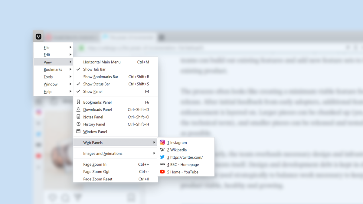
Web Panels being one of our top distinguishing features, we worked out that a shortcut to them belongs in the menu. If you’ve placed an app in the sidebar (Web Panel), you likely want fast access to it – typically, that’s your social media or news channels. By adding the Web Panel to the menu, we made access even easier.
We also figured that we should add the Tab Bar to the menu. Many of you switch it on and off all the time, and some like to hide it altogether, making way for more screen real estate. That’s now easy to do from the redesigned navigation menu.
We tweaked the Bookmarks section of the menu too. Bookmarks were listed in the menu before but there was no context menu with further actions. After the redesign, you can right-click Bookmarks and do all sorts of things with them.
* * *
Over to you now. Do you rely on the menu for your workflow?


