Vivaldi offers infinite ways to personalize your browser, and we want to share some unique setups with cool customizations for you to make the Vivaldi browser look and feel the way you want it to.
You get to decide whether you want the browser setup to reflect your inner vibe, mimic real-world surroundings, or serve as a reminder of when you need to take a moment to relax.
Here are 5 community-sourced setups picked by our team, showcasing what you can do to make Vivaldi adapt to you:
Finer changes, huge impact
If you like serene colors, pay more attention to the details, and love staying organized, you’ll enjoy creating custom thumbnails, like in the first two rows of the setup below.
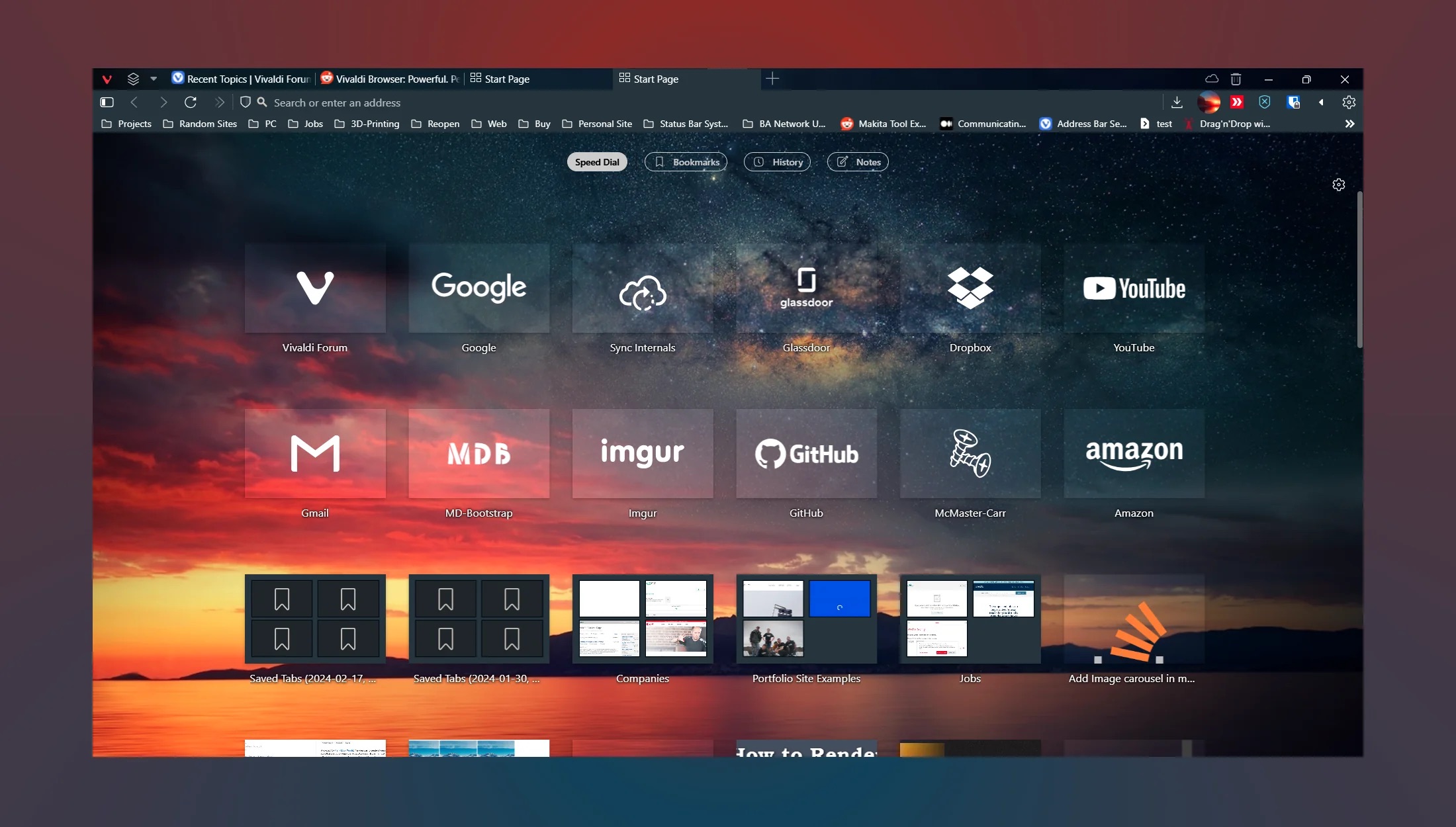
From this setup, you can see many custom modifications can be made to the browser, such as the invisible Address Field, which is a CSS mod and not a setting. It gives you easy access to your frequented websites from the Speed Dial thumbnails, creating an intuitive experience. Learn more about how to add thumbnails on your Speed Dial. Head to our Community Forum, subreddit, or Discord to get trending ideas.
From cool to cozy themes
If themes are super important to you, you could also import a theme and make CSS changes like the one below.
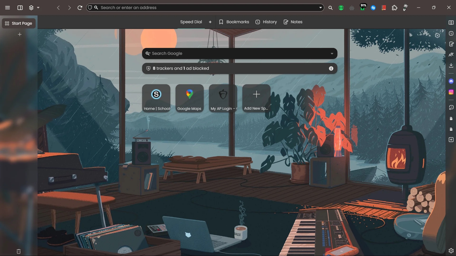
For a cozy vibe, the rounded corners and slight modification in the Tab Bar add a sense of calm to your setup, with the level of personalization needed to give your browser the look of a cozy online home.
The transparent vertical tab and intentional setup of the buttons give your browser a tidy look to make it easy to find your frequented websites.
Here’s how you can turn your tabs transparent:
Settings > Themes > select a Theme > open Editor > go to Settings > check “Transparent Tab Bar”
Extensions to extend your browser’s personality
Not all alterations to Vivaldi need coding or design skills. You can change the look of the New Tab page using extensions. For example, this user installed an extension called Nighttab.
In this setup, collapsing vertical tabs that expand on hover, was made possible with custom CSS. This is another example of a clean panel with frequently used apps, a minimalistic Address bar, and the classic extensions pinned.
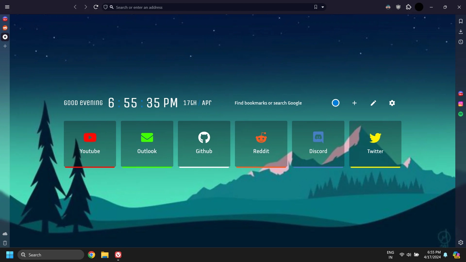
The custom Start Page in the soothing shades of green and the Tab Bar on the left – all richly add to the minimalistic look and feel of the browser.
If you’d like to upload a custom thumbnail to a Speed Dial or Speed Dial folder, right-click a Speed Dial icon or a Speed Dial folder and select an image. We recommend 440×360 px and most image formats are supported, including animated GIFs.
Turn to the Dark Mode
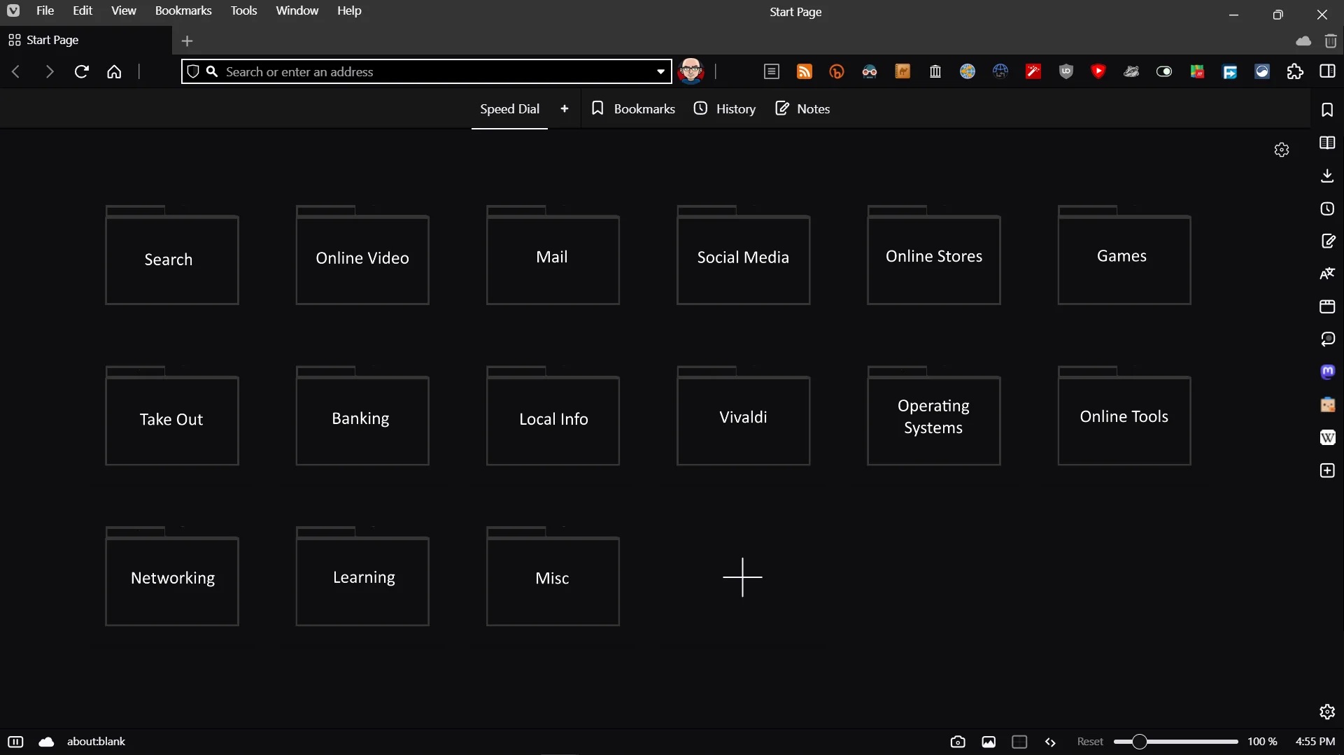
If you like using Dark Mode the entire time, like you do on your system, then you’d like this setup. The hidden extensions and horizontal menus aim for higher functionality and using the Speed Dial Layout as a UI for your most used bookmarks, is genius.
The folders for the Speed Dial and the number of extensions here, do not take into account the ones hidden.
If you want to hide your extensions RMB > Hide button” > “Right-click on the extension’s button > Hide button”
When less is more
Moving the Address Field Toolbar to the bottom can be a cool personalization feature if you’re not married to it staying stuck in one place.
Going for minimalistic and zen vibes? Look no further than this serene setup.
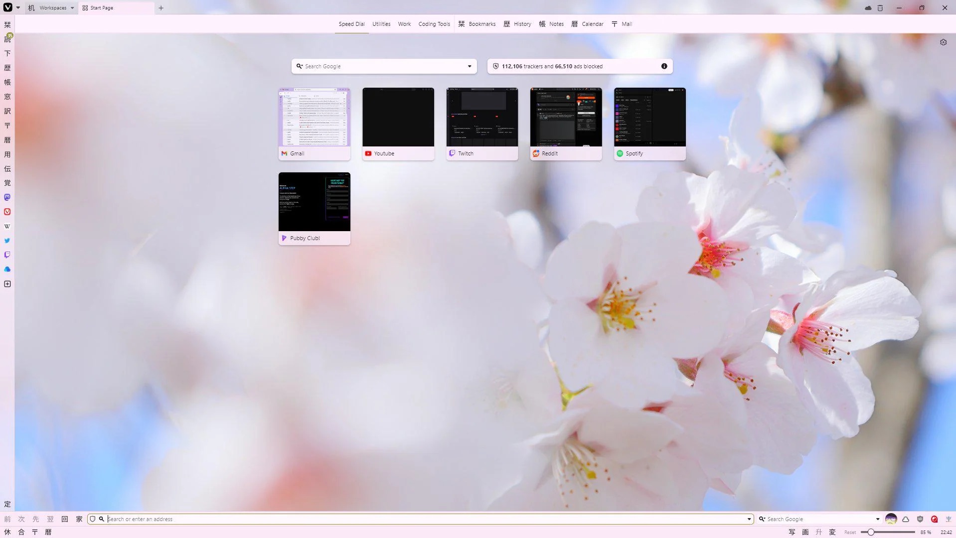
To move the Address Bar to the bottom go to Settings > Address Bar > Address Bar Position
The original theme is called Nihongo in case you’re all in for zen vibes and the icons.
You can take a look at the original Reddit post and the Modifications Forum for more awesome ideas.
So, which one is your favorite and what would you like to try on your browser? Let us know!

