A lot has changed since the release of our first Technical Preview back in January 2015. Every time we release an update to the Vivaldi browser, we change things all over our interface. You might not notice most of those changes, which is good. It’s an organic process where we evolve over time – naturally. We keep on improving one area at a time, gradually lifting the overall experience from using the browser.
One thing that’s remained unchanged, however, was our icon.
The original “V” was made for us by an external designer Sean O’Grady. We used it to make the final application icon that you’ve been using for the past two years.
As far as the Vivaldi branding goes, we haven’t really done nearly as much with it as it deserves. We have no design agency working for us. What our brand looks and feels like today is a result of what we do as a company. It’s the browser itself, as well as our websites, community and other channels that shape the perception of the brand.
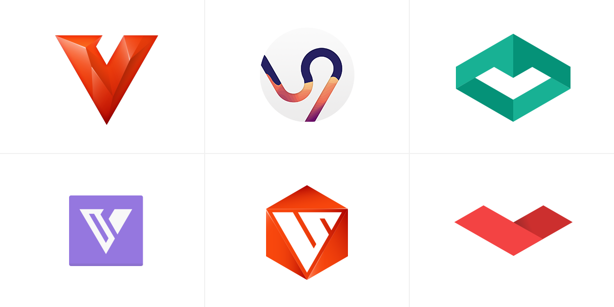
For a designer, it’s natural to constantly feel the need to improve and iterate on every aspect of the product. Over the years, we have played with several ideas on how to make our icon feel at home and fit what our browser has become.

These are just a few of the ideas we’ve been playing with. For many designers, including myself, it’s almost an instinctive thing to want to start from scratch. However, the more we tried, the less natural it felt. We have come to realize that our icon should, just like our interface, reflect the evolved progression of Vivaldi. Why toss away the familiar? People know our rounded little “V”, and it was important to not discard this fact.
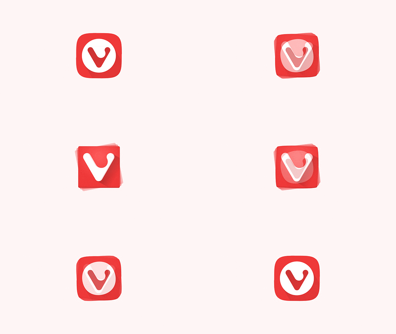
Although the old icon has served us well, the heavy use of gradients, shadows and transparency has made it somewhat challenging to work with in many instances.
We wanted to simplify and modernize its appearance to reflect the playfulness of our browser. At the same time, we wanted to make sure we kept the original “V” intact. Result? The new icon is rounder, friendlier and simpler in its form.

As we grow and mature as a company, being consistent in our visual communication is crucial. This update to our icon marks the beginning of a larger internal process. Our company has grown vastly during the past two years. Having documentation and visual guidelines is essential for a good workflow and clear communication with you, our users. Going forward, there will be updates to our web pages and every aspect of the Vivaldi community.
We hope you like the direction we are heading. Follow us – there’s more to come.

