Read this article in español, 日本語.
At Vivaldi, we have long advocated for people to be able to select their favorite browser. We picture a world where upon setting up a new device, you are presented with the option to choose your browser. Whether your device is an iPhone or an iPad, an Android device, or a Windows PC, your journey should start by selecting the app you use to go online. That choice should be made in an informed manner.
Doesn’t that sound like a dream?
Well soon, thanks to the EU Digital Market Act (DMA), we will be one step closer to this reality. This new regulation aimed to reign in the powers of Big Tech mandates among other things that they loosen their grasp on the web. One part of this is the requirement to implement Browser Choice Screens.
The new requirement applies to several big platform owners, such as Apple, Google, and Microsoft, dubbed Gatekeepers in the DMA.
Needless to say, we are pretty pleased with this.
Browser Choice Screens have been tried before by Microsoft, following a different EU ruling. At the time, we saw that it was absolutely possible to implement them in flawed ways. And there is a risk that they will be.
Indeed, gatekeepers, as platform owners, exert natural control over the software and apps available on their platforms. The ability to gather more data about their users through their own browser provides them with an incentive to impose that browser on their users. This incentive leads them to use their privileged position to stifle competition, favor their own products and apps, and dissuade them from installing competing software. With that in mind, they might decide not to care about implementing an effective choice screen.
To make matters worse, without choice, the platform owners’ apps do not need to compete on their merits. They may be ill-suited to their user’s needs and be of poor quality. In an environment built on standards such as the web, this can lower the quality of the web as a whole.
However, while gatekeepers can indeed choose to be a problem and act purely in their self-interest, they can also choose to do the right thing. We do believe that doing the right thing is going to be good for them in the long run as they will have a more sustainable relationship with their user base. To provide some guidance over what the right thing is, we present the following tale.
A Tale of Two Gatekeepers
Let us look at two archetypal companies to demonstrate how bad (or how good) a Browser Choice Screen can be. They are both large corporations, controlling popular platforms, and are the gatekeepers for this exercise.
IronGrip Inc. sees the DMA purely as a nuisance. They spend countless hours in frivolous meetings arguing over the best way to comply with the new regulation. They still want to make sure their users stick with their app.
As they explored the problem, someone proposed to weaponize the newly mandated Choice Screen. The idea resonated around the organization. Eventually, the decision was made, “These fools at the EU will know not to mess with us again! We will make this the most painful experience imaginable for anyone who dares to engage with it!”, they gleefully wrote in the memo from that meeting. “They will regret not having chosen the easy path out and stuck with us. And they will be convinced that the EU hates users,” they concluded.
Meanwhile, at the headquarters of FreeChoice Ltd, the news about the Choice Screen is met with a more measured response. They are not thrilled to admit it, but they agree with the EU regulators. FreeChoice Ltd had clearly gone astray in the past in trying to conquer the market. In doing so, they have built insurmountable barriers for all competitors and have alienated their own users. Clearly, the Browser Choice Screen is an opportunity to make things right.
And so, the two rivals set out to work on their Choice Screen. One reluctantly with malicious intent, and the other with a cautiously optimistic approach.
Now, let us compare the Choice Screens the two companies implemented.
IronGrip vs FreeChoice
The right time to show the Choice Screen
IronGrip: When the user clicks a browser icon.
FreeChoice: As early as possible during device/OS installation or update.
IronGrip Inc. through their market research discovers that once the user has started a browser, they are in the mindset of using that browser and surfing the web. They might be happy setting up that browser, but anything else is inconvenient. This will be the perfect time to show their Choice Screen.
Meanwhile, FreeChoice Ltd wants their user to pick a browser when they are in the mindset of setting things up. The best time for this is when first setting up or updating their device. They discover that users tend to hurry through the last step of the setup process as they lose interest in it. So they make sure to show the browser screen as early as possible, right after having asked the user for essential settings.
User influence
IronGrip: Makes sure the user has seen the gatekeeper’s browser icon or brand colors, before the choice screen.
FreeChoice: Avoid displaying even brand colors before browser choice occurs.
IronGrip makes sure that the user has seen what the icon of their browser looks like by the time the Choice Screen shows up. They will probably pick that one to get on with their day.
FreeChoice realizes that any hint of what might be the default for their platform will make the user subconsciously trust that choice more. Unfortunately, their brand colors show up a lot through the early stage of their setup process. They have to show their brand logo when starting the device — that is unavoidable. But they make sure to make the setup process look as neutral as possible up until the browser choice has happened.
Impatience is the enemy of choice
IronGrip: Provide a way to skip the Choice Screen. No guarantee it will be shown again.
FreeChoice: Do not provide a way to skip the Choice Screen.
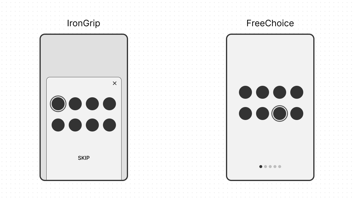
IronGrip has already made their Choice Screen show up at a maximally inconvenient time and made sure users were likely to select them anyway. But if a user is hesitating, they don’t want to force them to take the time to think. They add a handy option to come back to the Choice Screen later. Then they can just ask again sometime soon. Or maybe not so soon. Or maybe ever? At any rate, if they ask again, it will probably be while the user is watching a video.
FreeChoice understands that the longer the user waits to make the choice, the more likely they are to stick with what they have. So, they make sure that they have to choose the first time.
Expose users to more choice
IronGrip: Keeps randomization limited and promotes some items over others.
FreeChoice: Show a random selection with plenty of choices.
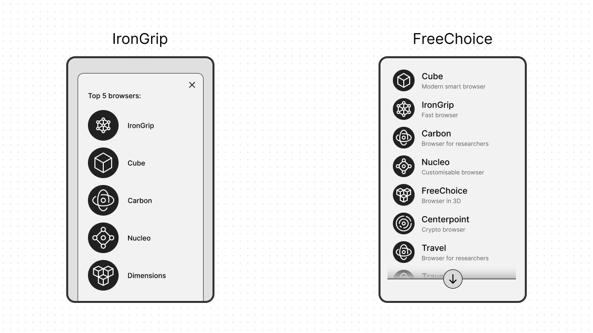
IronGrip certainly has made it likely that users will recognize and choose their browser, but for this to have the best chance of working, they must make sure that their browser appears prominently on the Choice Screen. So, they come up with an excuse. The Choice Screen is supposed to be randomized, but, they argue, that the choices the user is most likely to be familiar with should be closer to the top. That makes the user’s life easier. Of course, they then place themselves among the top contenders and randomize those separately from the rest. It doesn’t matter where they end up on that initial screen, so long as they are there. This considerably increases the odds that the user will choose IronGripBrowser.
FreeChoice has the insight that with more browser diversity and competition in the market, there will be a lot of incentives for the web to develop in new and exciting directions and give them an incentive to improve FreeChoiceBrowser. Therefore, they make sure to calibrate their design to be readable while also showing as many options as possible on the screen. To fully give everyone an equal chance, they make sure that all the options have an equal chance of being shown.
Sometimes, the FreeChoiceBrowser is at the bottom of the list and users have to scroll all the way to find it, but that’s ok. They get to see what’s out there.
Help make a meaningful choice
IronGrip: Show just a name and icon. No description. Any browser the user doesn’t know will be a mystery.
FreeChoice: Add some descriptions. The most important information is always visible.
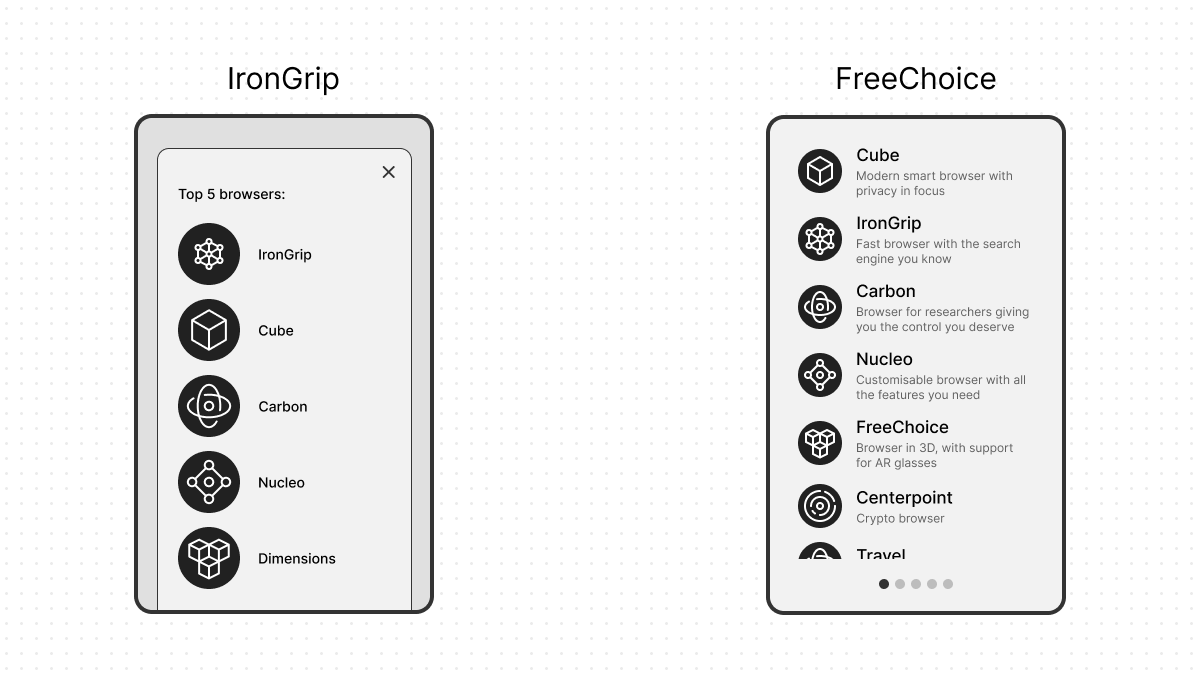
IronGrip certainly has made it likely that users will choose their browser, but if they are really in the mindset of trying something new, IronGrip doesn’t want to make it easy for them. After all, that might just help create one more serious competitor they have to deal with. So, they make sure to provide only minimal information. Just an icon and a name should be enough.
FreeChoice also understands that people are likely to choose something that looks familiar, but at least they want people to know what they are getting into. So, they request each vendor to provide a few lines to describe their browser. This lets users make a choice that aligns with their values and needs.
Make sure all choices are useful
IronGrip: Include some underwhelming or hard-to-use options and exclude some obvious competitors.
FreeChoice: Use a submission process. Push for all relevant browsers to be included. Keep to one browser per competitor.
IronGrip has already made its Choice Screen as confusing as possible. But if users decide to pick a less well-known option despite everything, it is best to make sure they get an underwhelming experience or even a bad one. Or one that’s still IronGrip in disguise. To achieve that, they add into the mix some browsers that are just copies of existing ones with different branding, or extremely minimal changes. Some of those copies are clones of IronGripBrowser itself. Some of them are abandoned projects with no updates. They also add a few experimental or specialized choices that are not designed for regular web browsing, or only intended for use in specialized circumstances or on very specific websites, and will not work well for anyone else. Finally, they also avoid adding some legitimate contenders, making the experience maximally frustrating for everyone.
FreeChoice has already made sure to have a clear description for every browser, so at least the experimental ones can be clear about the challenges involved. Even so, they make sure that only browsers that wish to be part of the selection are there and encourage featureful browsers to apply. They also ensure that each company has no more than one browser included and that the included browsers are updated regularly.
Ensure the chosen browser is easy to start
IronGrip: The chosen default browser is hidden away while the gatekeeper’s browser is easy to access.
FreeChoice: The chosen browser is easy to find.
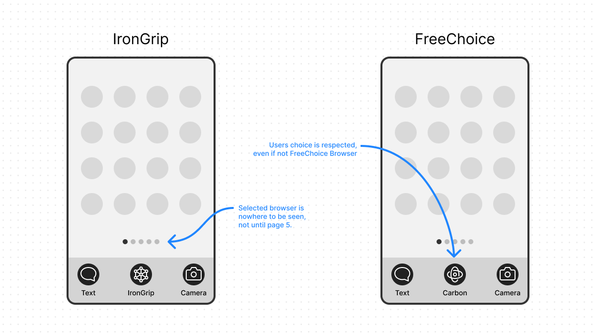
Even if the user has managed to pick something they love from the convoluted IronGrip Choice Screen is not the end of their frustrations. First of all, the IronGripBrowser is still shown on the main screen and the one they set up is nowhere to be seen. It takes a while to discover that to launch it, they have to wade through the list of installed apps.
FreeChoice respects what the user has chosen. If it was not selected, FreeChoiceBrowser is nowhere to be seen and there is no obvious way to start it.
Ensure the chosen browser is easily used
IronGrip: Apps distributed by IronGrip always use the IronGripBrowser.
FreeChoice: The chosen browser is always started for browsing.
In addition to making the chosen browser hard to find, most of IronGrip’s own apps and services just ignore the default and start the IronGripBrowser when navigating. With that, IronGrip has made sure that the user would quickly forget what they have chosen and stick with the IronGripBrowser instead.
FreeChoice makes sure that opening any link anywhere results in the user’s chosen browser to be started.
Let people change their mind
IronGrip: There is no easy way to make a different choice.
FreeChoice: The Choice Screen can be restarted on demand.
IronGrip has put a lot of effort into having their browser ending on top, they’re not about to let someone change their mind and pick a different one later on. They make sure that if the user tries to change the default browser, they have to navigate a maze of settings and change every small detail that affects which browser gets started when in multiple unrelated places. In fact, it might be easier to just buy a new device if you want to switch the default browser.
FreeChoice has a single prominent option leading back to the Choice Screen. They also expose more advanced settings, for users who understand what they are doing, but in most cases, making a new selection via the Choice Screen does the right thing.
Handling of newly installed browsers
IronGrip: A newly installed browser cannot just become the new default.
FreeChoice: Provides an easy way for any browser to become the default.
IronGrip has made changing the default browser almost impossible, the same applies to any browser that the user manually installs.
FreeChoice makes a smaller version of the Choice Screen to deal with browsers installed manually. Whenever an installed browser requests it, this screen shows up, asking users if they wish to change the default to this new browser or keep the existing one. They rely on existing malware removal techniques to deal with any illegitimate software abusing this feature.
Don’t force people to change their minds
IronGrip: The platform regularly discourages using the chosen default and even attempts to hijack it.
FreeChoice: IronGrip is really pushing it now. We don’t do that.
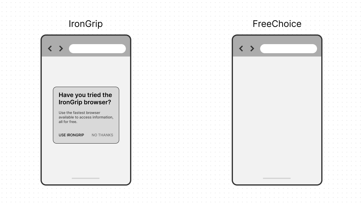
If someone didn’t choose IronGripBrowser, IronGrip likes to remind them on every occasion that they have made the wrong choice. They will express concern about how secure the chosen alternative is and ask if the user really didn’t mean to use the secure default they provide. Not only that, but they are avidly using dark patterns, attempting to trick people into choosing IronGripBrowser whenever they ask. By now, it has become clear that their Choice Screen was never meant to provide an actual choice.
FreeChoice doesn’t do any of that and is putting out a statement complaining about IronGrip.
Bonus section: Allow procuring browsers from anywhere
IronGrip: The platform limits which browsers can be installed.
FreeChoice: The platform allows installing browsers from any source.
IronGrip only allows people to obtain new software through their store of which they have full control. In this store, they can freely decide whether a given browser is allowed or not. If they opt to not have a given browser there, then it’s tough luck for the people who want to use it. Even if a browser is present, they can make it arbitrarily hard to find, sometimes making competitors show up when looking for a specific browser.
FreeChoice happily lets anyone install software from any source they choose. They have some malware protection in place to weed out genuinely bad actors, but they use it responsibly.
What of the real Gatekeepers
With the Browser Choice Screen requirements soon to be effective in full force, we are starting to get to know more about how the actual gatekeepers are designing their Choice Screens.
Certainly, we hope to see everyone strive to be like FreeChoice. Most people stick with the default when selected so they must be able to make a meaningful informed choice from the start. All points presented here are crucial to achieve this result and skipping any of them would seriously erode the effectiveness of the Choice Screen. We believe that gatekeepers can get out of the mindset that they must coerce their users into using a given browser and truly embrace choice, allowing competition to flourish in the browser space once more to the benefit of everyone.
If browsers are offered and selected based on their merits, then the Choice Screen will truly have fulfilled its purpose.
Do any of the gatekeepers have a Browser Choice Screen that makes the cut? We will take a closer look when they get released in a few weeks. Meanwhile, if you encounter a Browser Choice Screen, you can use this handy table to remind yourself of what to look for.
| IronGrip | FreeChoice | ||
|---|---|---|---|
| Shown when the user clicks a browser icon. | 👎 | Shown as early as possible during device/OS installation or update. | 👍 |
| Make sure the user has seen the gatekeeper’s browser icon or brand colors, before the Choice screen. | 👎 | Avoid displaying even brand colors before browser Choice occurs. | 👍 |
| Provide a way to skip the Choice Screen. No guarantee it will be shown again. | 👎 | Do not provide a way to skip the Choice Screen. | 👍 |
| Keeps randomization limited and promotes some items over others. | 👎 | Show a random selection with plenty of choices. | 👍 |
| Show just a name and icon. No description. Any browser the user doesn’t know will be a mystery. | 👎 | Add some descriptions. The most important information is always visible. | 👍 |
| Include some underwhelming or hard-to-use options and exclude some obvious competitors. | 👎 | Use a submission process. Push for all relevant browsers to be included. Keep to one browser per competitor. | 👍 |
| The chosen default browser is hidden away while the gatekeeper’s browser is easy to access. | 👎 | The chosen browser is easy to find. | 👍 |
| Apps distributed by IronGrip always use the IronGripBrowser | 👎 | The chosen browser is always started for browsing. | 👍 |
| There is no easy way to make a different choice. | 👎 | The Choice Screen can be restarted on demand. | 👍 |
| A newly installed browser cannot just become the new default. | 👎 | Provides an easy way for any browser to become the default. | 👍 |
| The platform regularly discourages using the chosen default and even attempts to hijack it. | 👎 | IronGrip is really pushing it now. We don’t do that. | 👍 |
| The platform limits which browsers can be installed. | 👎 | The platform allows installing browsers from any source. | 👍 |

