Mostly blending in, going un-noticed but still always there and frequently used, the UI (User Interface) icons are a large part of what makes Vivaldi look and feel like Vivaldi. Over the years we have been adding new ones as we get more features and settings.
Now, in Vivaldi 2.4 with the ability to customize the interface even more – you can drag and drop practically any button anywhere – we took this as an opportunity to revisit and refine our icons.
Consistency
The first issue we wanted to address was consistency. When looking (very) closely on the old icons you would notice inconsistencies in corner radius, strokes, and angles. Sometimes they were just mistakes, not intended, and other times they were the result of several people contributing over time – using different types of software and techniques.
![]()
Old and New. Notice the inconsistent angles of the old icons.
Looking at the image above you get an idea. This is just a small set of the icons (roughly 120 in total), but we re-drew every icon from scratch to get the same level of consistency across the board. Sometimes fixing the angle to be 45 degrees (at times off by just 0.5 degree), sometimes uneven strokes and some vector points simply not on grid.
Collaboration
Another thing we did to help maintain consistency across the team was to use the collaborative design tool Figma. That means everyone works on the same file, even simultaneously at times. No confusion what’s the latest version – and we can always go back in history to see changes done.
Harmony
Another element of our interface that has been around since our first public release was the very sharp edges used for our icons. That fit us well at the time since every other element was sharp and pointy, too.
Now, a while back we updated the Default Theme to use a corner rounding value of 3 pixels, compared to 0 before. With the rounder UI elements, the icons started to disturb the balance of our UI (and perhaps The Universe?!)
So in order to achieve greater overall harmony, the new icons also feature slightly rounder corners. Softer and friendlier, just like the application icon. See how it all comes together?
Size variations
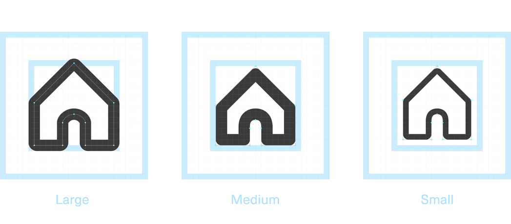
All our icons (or ~ 99% of them) are SVG, which is a vector format. This allows us to color them the same way we do text and other elements you can control within the Theme settings. Even though SVG can be scaled up and down indefinitely, it does not always yield crisp results.
 In order to make sure our icons look and perform their best, we defined 3 sizes that will be re-used across the entire application. This way, if you drag the Home button from the main toolbar down to the status bar, it will still remain nice and sharp, with an even 2px stroke just like the larger version.
If you want to know more about the nitty-gritty details and technicalities that go into this, read this great article by my colleague Henrik.
Going forward
Does this mean we’re done now? Of course not. We are relentless in our pursuit of quality and consistency – we’ll never stop. We will open up more areas of the UI so you can get even more freedom to have things just the way you prefer. A larger “Edit Mode” is in the works, as well as updates to our Theme system. A lot to look forward to!
Vivaldi adapts to you, not the other way around – remember?
I hope you enjoy Vivaldi 2.4! Let us know in the comments what you’d like to see more of as we move forward.

