Read this article in Español, 日本語.
Recently, we launched Vivaldi 6.0 on desktop, with Workspaces and Custom Icons. These features were in development for quite some time, and we had a lot of discussions regarding their potential use and the new possibilities they could open up for our users.
We are continuing our work on Workspaces – both in terms of polishing and adding new functionality. When a colleague recently suggested that it would be nice to be able to use Themes to tell different workspaces apart, I explained that it’s already possible, with existing tools. We all agreed I ought to share a how-to with our community, so here we are!
Let’s look at some of the cool things you can do in Vivaldi now that may be new to you.
In the video below, I show you how to switch Workspaces with a single click, how to add Custom Icons to navigate between Workspaces, and how to use different Themes with each Workspace while making it look visually appealing.
Switching Workspaces by using dedicated buttons
It is possible to navigate around Vivaldi’s user interface in different ways. You might prefer to use your keyboard for almost everything, or perhaps you only use your keyboard for typing text. I’m the kind of person who knows a fair amount of keyboard shortcuts but prefers to use the mouse most of the time.
When it comes to Workspaces, you can switch between them using the Workspaces menu, Keyboard Shortcuts, Mouse Gestures, or Quick Commands. But that’s not all. With just a few clicks, you can create dedicated buttons for your Workspaces and place them on any toolbar!
To do this, we’re going to use Command Chains. All we need to do is create as many Command Chains as we have Workspaces (up to 9) and add the command “Switch to Workspace n” in each one.
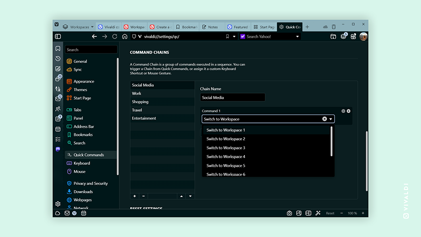
Then you can edit your toolbars by selecting the “Command Chains” group from the toolbar editor dropdown and dragging your newly created buttons to any available toolbar.
By default, all Command Chains use the same icon, which can make it difficult to tell them apart when placed side by side. This is where the ability to make Custom Icons can come in handy.
First, you’ll need some icons. You can create your own (if you happen to be a designer) or download some free icons from one of the many sources available on the Internet, such as Flaticon, Google Fonts, Icons8, IconScout.
Once you pick the perfect icons for your Workspaces, you can add them by editing the current Theme. Go to Settings > Themes > Editor > Icons and scroll down to the “Command Chains” group. You can replace the default icons with the ones you’ve picked there.
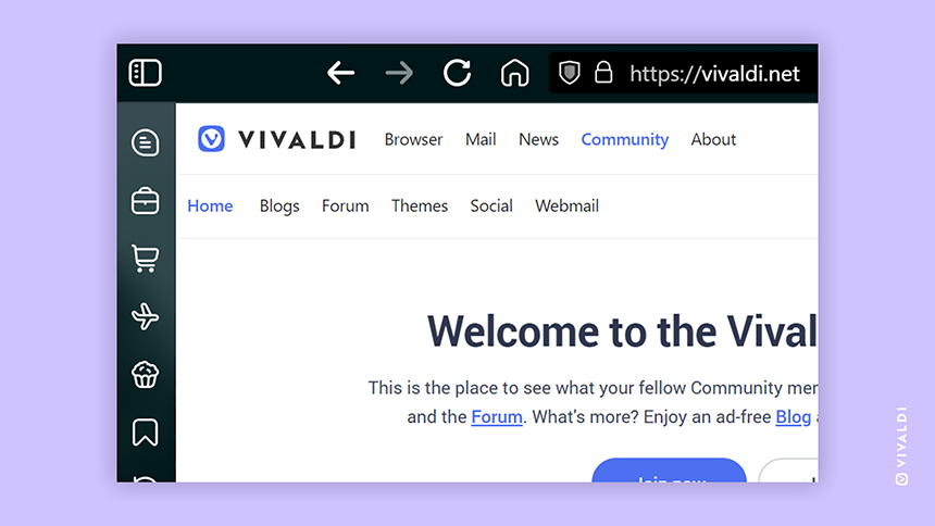
Using different Theme for different Workspaces
Once you create Command Chains for each of your Workspaces, you can expand their functionality by adding other commands.
By combining the commands “Switch to Workspace” and “Switch to Theme” within a single chain, you can achieve the effect of assigning different Themes for each of your workspaces. Pretty cool!
You can use one of the default Themes, create your own, or choose from our collection of thousands of Themes created by our Community.
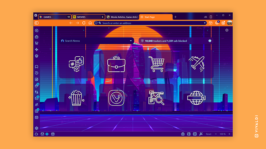
If you prefer navigating between Workspaces with Keyboard Shortcuts or Mouse Gestures, remember to assign them to your Command Chains (instead of the “Switch to Workspace” command). Please remember that this method will not work with the Workspaces menu – but if you use buttons (or Keyboard Shortcuts/Mouse Gestures/Quick Commands), I suggest hiding the menu to make more room for your tabs.
Highlighting the active Workspace with a custom icon
I’m very detail oriented, and the way I personalize my browser reflects that. So let me add one more detail – this will be our final touch.
Now that we have different Themes and dedicated buttons for each Workspace, we can make those buttons look more prominent by adding some background. It takes a bit more effort, but the end result is worth it.
The idea is to change only the icon associated with the current Workspace, within the Theme used for that Workspace. This allows you to highlight the buttons corresponding to the currently active Workspace and maintains the Theme’s style.
If you don’t want to use different Themes with each Workspace but would still prefer to highlight the buttons, just create a few identical Themes (one for each Workspace) and change the buttons accordingly.
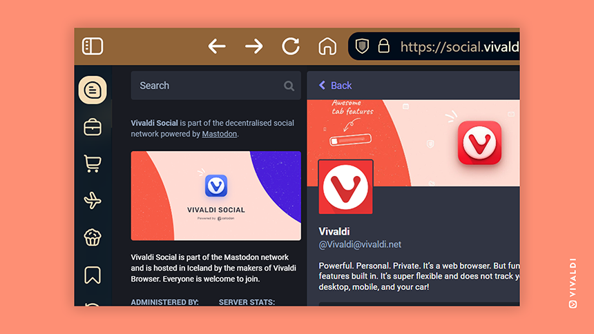
If you use bitmap images as icons (PNG, JPG, BMP, etc.), you’ll need to add backgrounds (or modify the image in a different way) by using an image editor.
For SVG icons, you can add the background using a text editor. To add a background, insert the following code right after the first <svg> element: <rect fill="var(--colorFg)" width="28" height="28" style="rx:var(--radius);" />
You can replace the fill value with a color of your choice. I prefer to use the theme’s foreground color to make the icons more flexible. To make it work, I added fill="var(--colorBg)" to every <path> element. The SVG file should look something like this:
<svg xmlns="http://www.w3.org/2000/svg" viewBox="0 0 28 28">
   <rect fill="var(--colorFg)" width="28" height="28" style="rx:var(--radius);" />
   <path fill="var(--colorBg)" d="(...)"/>
</svg>
With Vivaldi, the possibilities are endless
With this tutorial, I have shown you a new way to customize the Vivaldi Browser, but as you can see, the possibilities don’t stop there. I hope you will use this as inspiration to personalize your browser and try some of the tricks I’ve demonstrated – or maybe even share your own?
Do you use Workspaces, Command Chains and Custom Icons? Have you discovered any cool tricks to share? Let us know in the comments below!
The icons used in the presented Themes are Uicons by Flaticon.

